Personal Brand
A self-directed exercise in building my own visual identity — designing the brand I would want to present to the world.


Overview
Designing for yourself is harder than designing for a client. There is no brief to push back against, no stakeholder to align with — just the question of who you are and how that translates into a visual language.
This project is an ongoing exercise in building my personal brand from the ground up: a mark, a type system, a colour palette, and a set of touchpoints that feel genuinely mine rather than borrowed from wherever I was looking at the time.
Challenges
The hardest part of a personal brand is knowing when to stop. It is always easier to keep tweaking than to commit — especially when the subject is yourself. At some point you have to ship it, live with it, and let it evolve naturally rather than designing it to death in isolation.
The Process
Self-Definition
Before touching Illustrator, I spent time writing. What do I value? What kind of work do I want to attract? What should someone feel when they encounter my brand? The answers shaped every visual decision that followed.
Mark & Typography
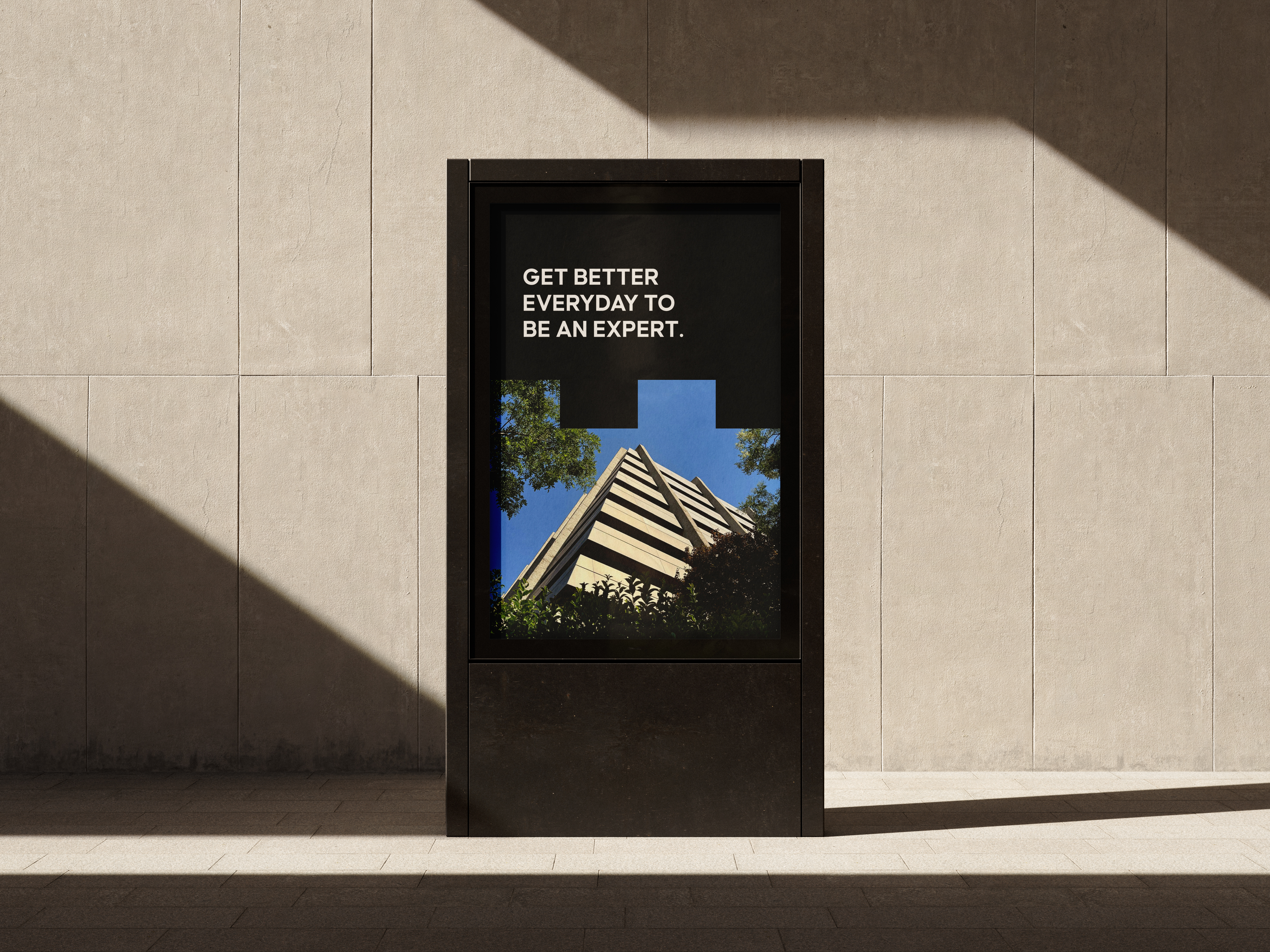
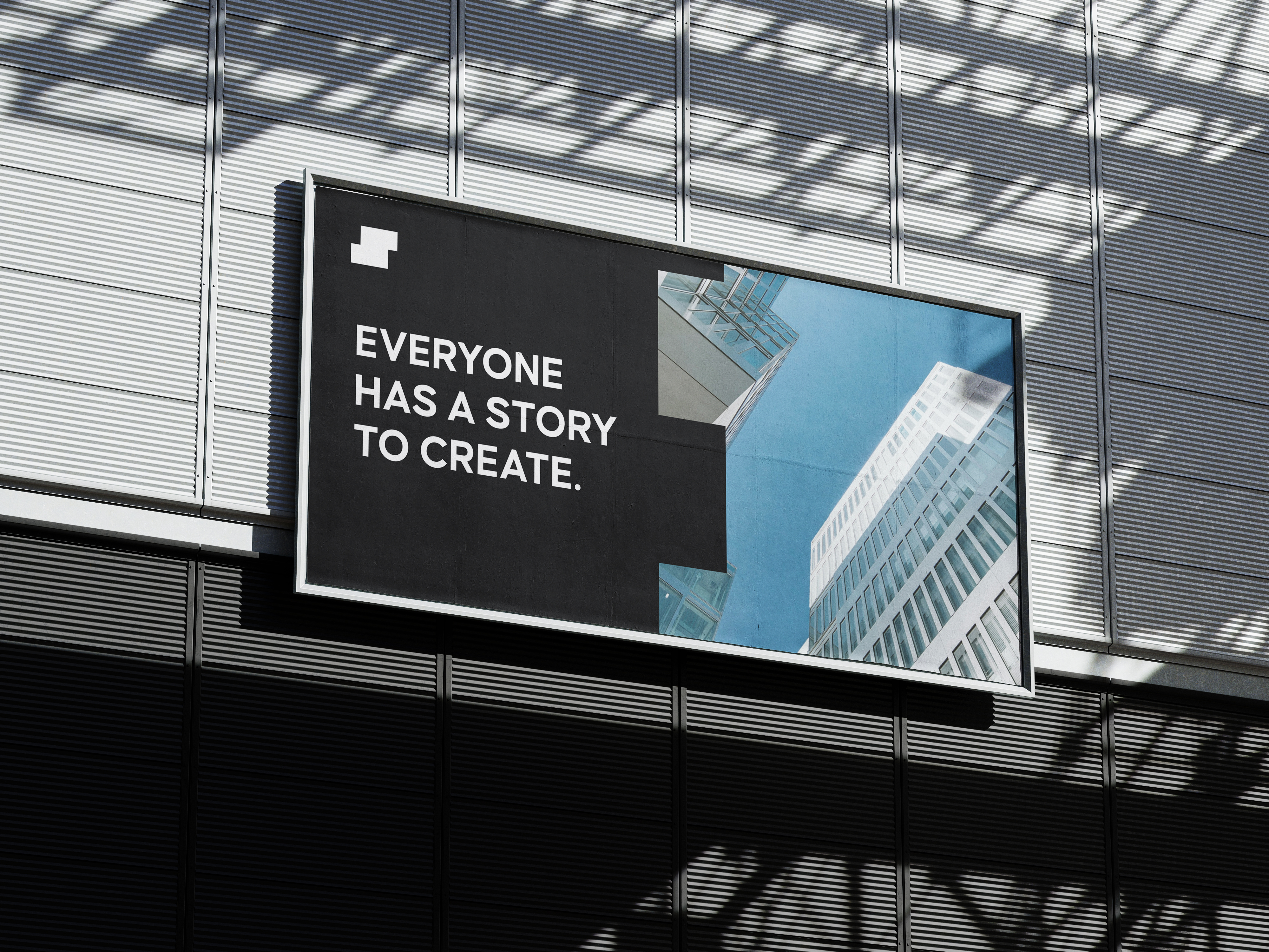
I explored dozens of directions before settling on a mark that felt both personal and flexible — something that could work on a business card, a website header, and a screen at a conference without losing its character. Typography was chosen to complement without competing.
Colour & Tone
The palette had to work across dark and light environments since my work spans print and digital. I landed on a combination that feels considered and contemporary without chasing any particular trend.
Application
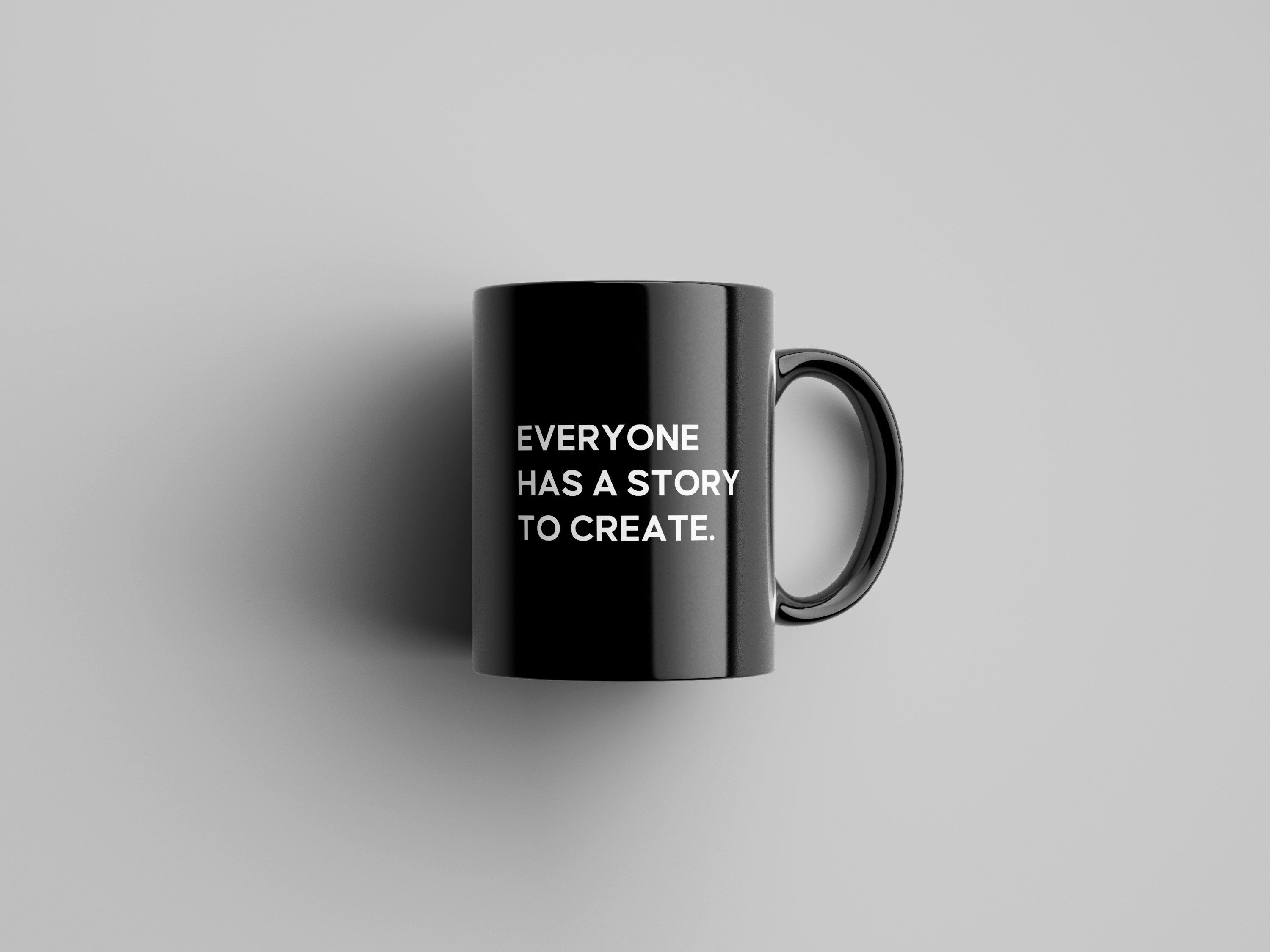
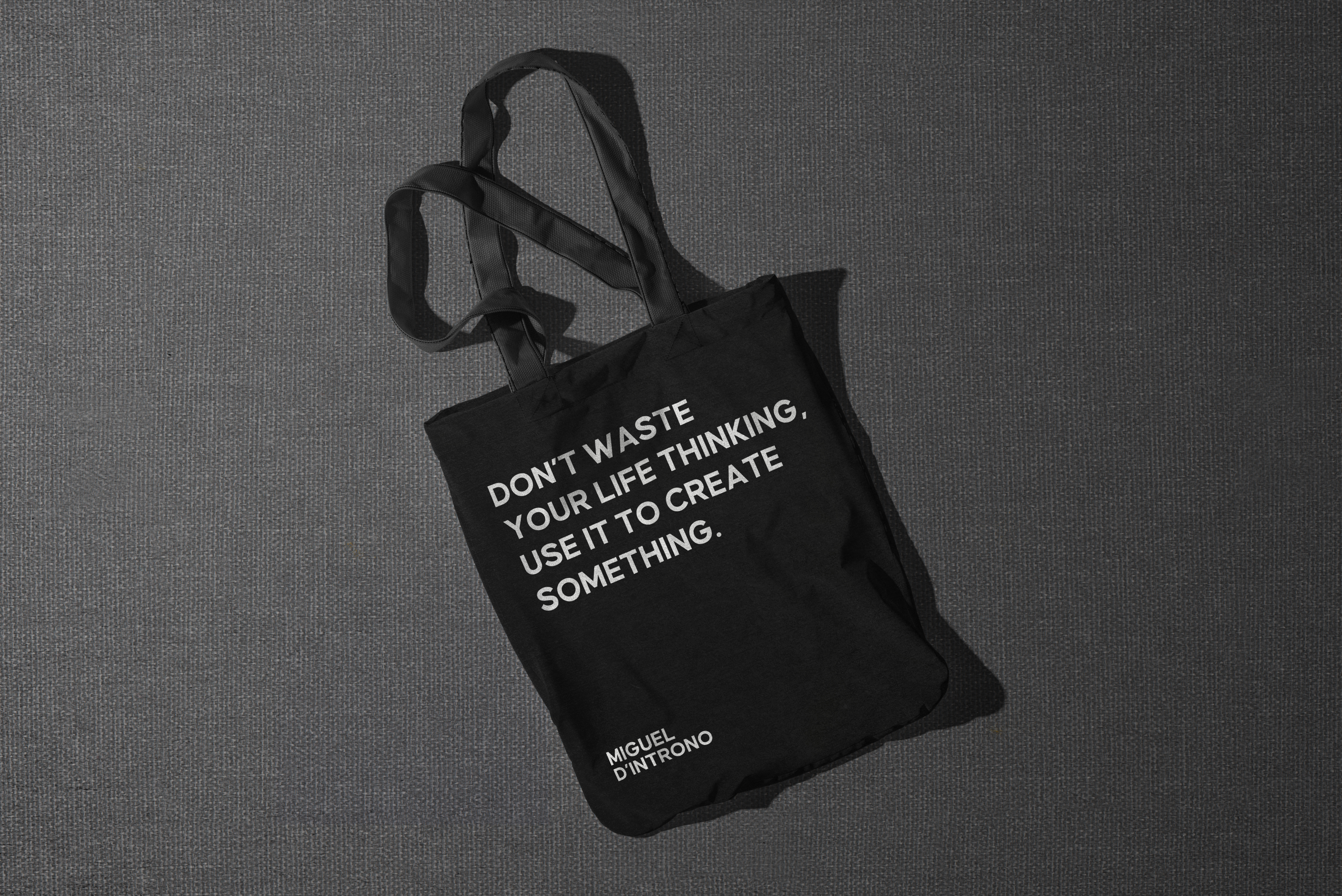
Figma and After Effects were used to test the identity across real touchpoints: portfolio, CV, social presence, and motion. Seeing it applied is the only honest way to know whether a personal brand system actually works.