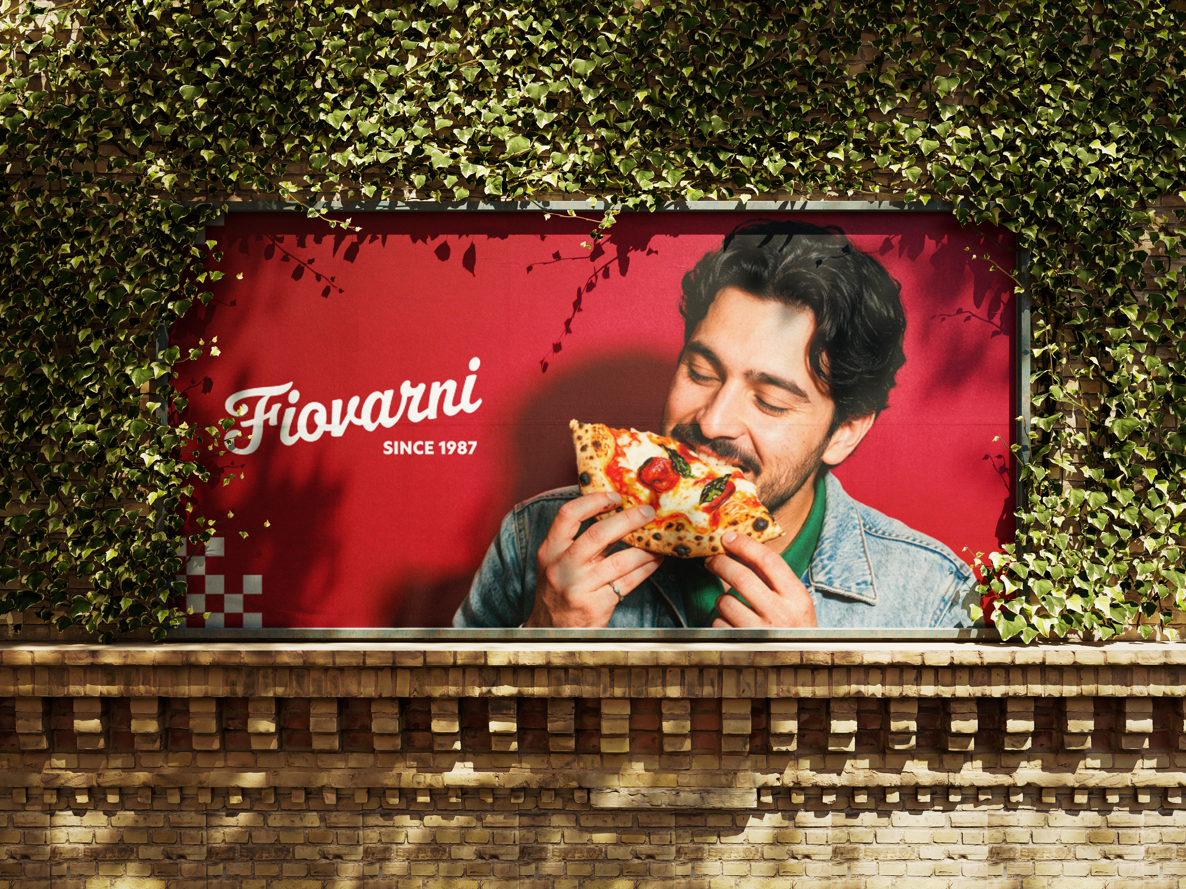
Fiovarni
Full brand creation for a Neapolitan pizzeria — from logo and visual identity to motion and digital touchpoints.
Overview
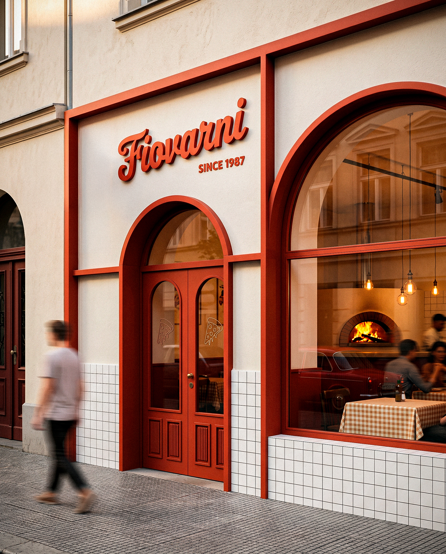
Fiovarni is a Neapolitan pizzeria concept built around the idea that great pizza is an act of craft, not convenience. The brand needed to honour that tradition while feeling contemporary enough to stand out in a competitive market.
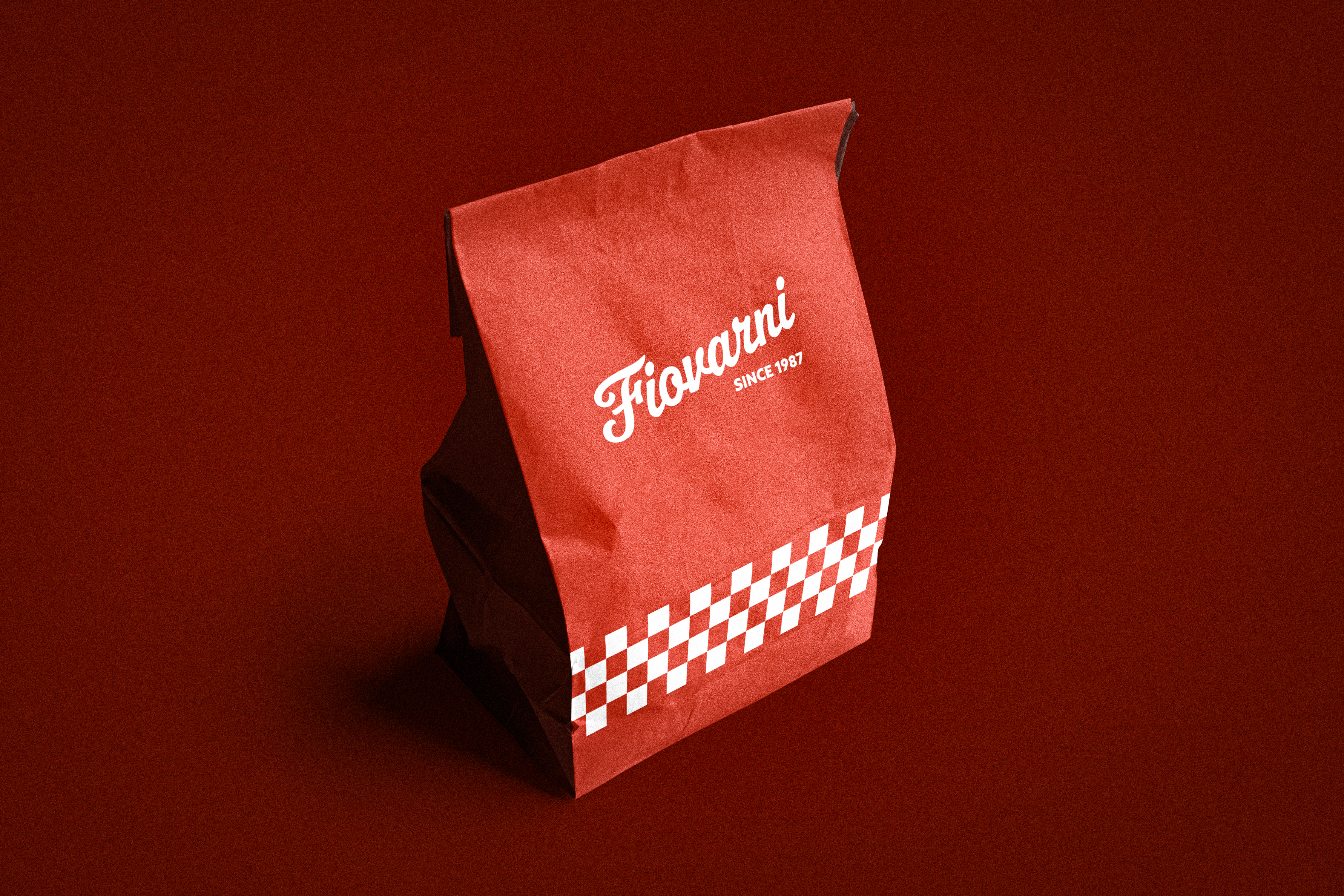
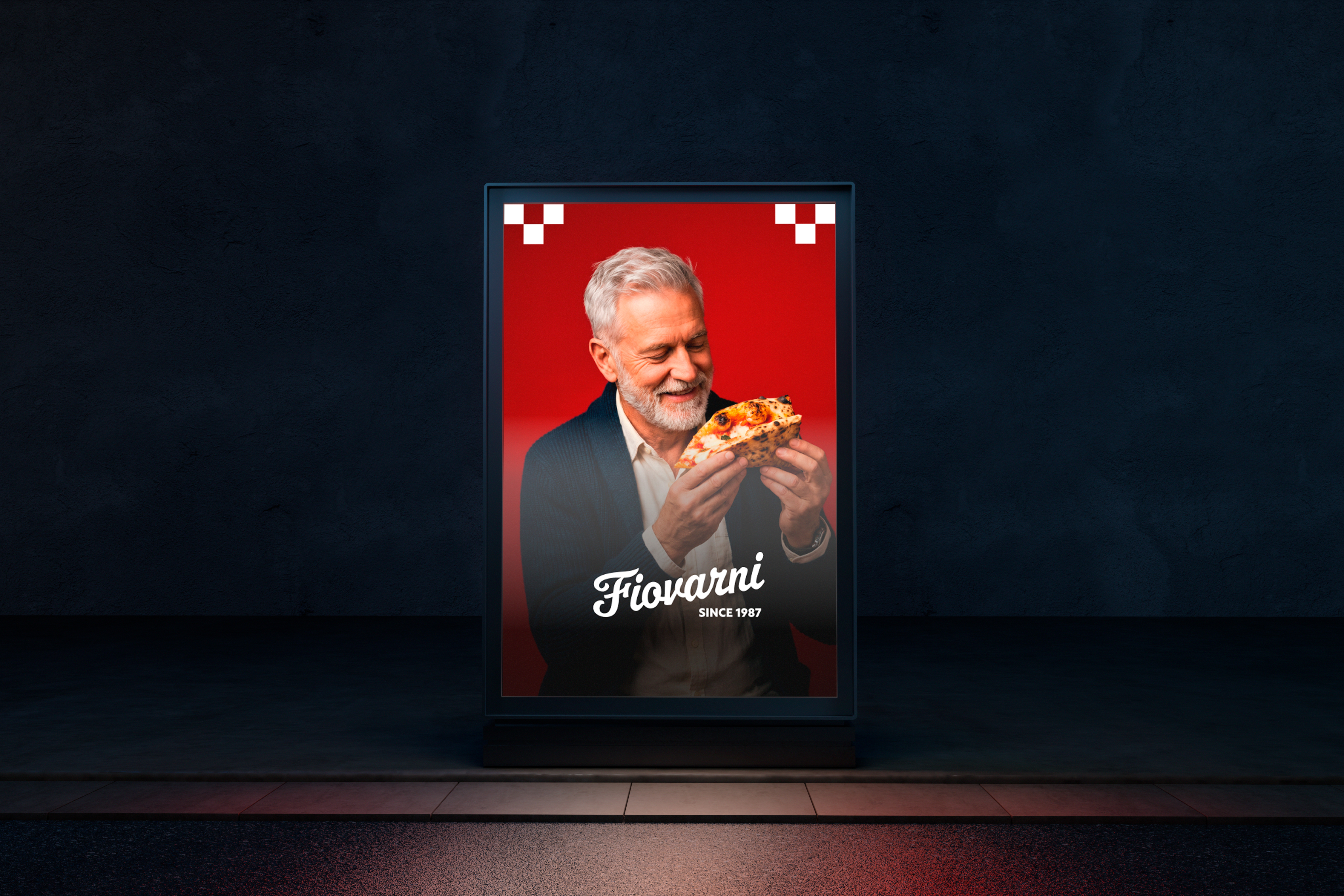
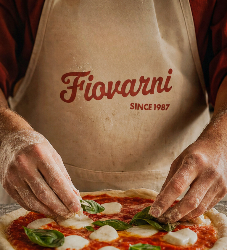
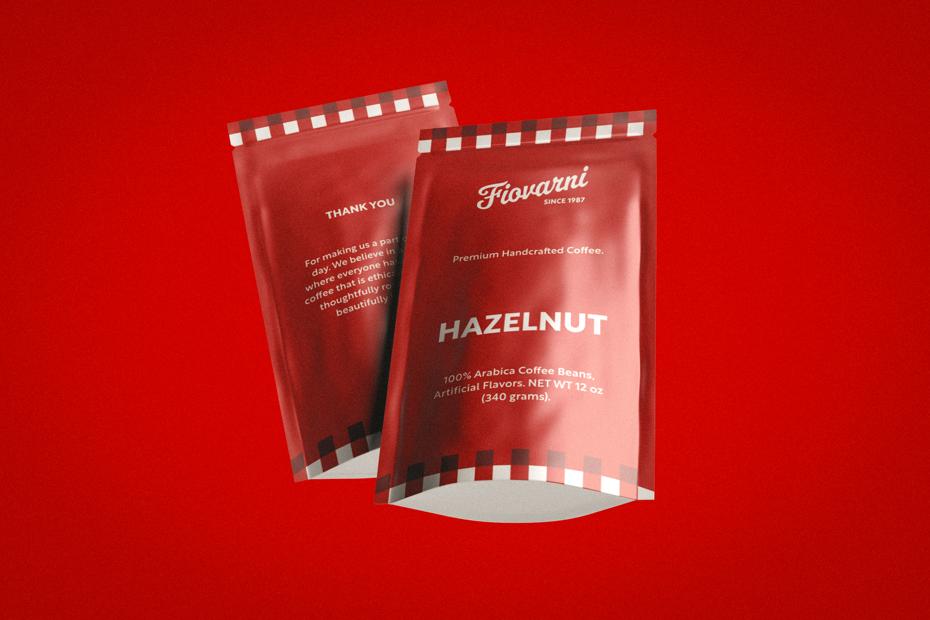
My role covered the entire brand: naming rationale, logo design, colour palette, typography, packaging, and motion — everything that defines how Fiovarni looks and feels across every touchpoint.
Challenges
The biggest challenge was avoiding the visual clichés that follow Italian restaurant branding everywhere — the red-and-white checkerboard, the tricolore, the cartoon chef. Every reference I explored had been done to death. The solution was to strip back to the essentials of the craft itself: fire, flour, and time — and build the identity around those three things.
The Process
Research & Positioning
I studied the visual codes of Neapolitan food culture — terracotta, hand-lettering, warm earthy palettes — and mapped where Fiovarni could differentiate. The brand needed warmth and craftsmanship without falling into cliché Italian pastiche.
Logo & Identity
The wordmark was built in Illustrator using a custom-adjusted serif with subtle flourishes that nod to Italian signage tradition. The accompanying mark — a stylised flame — references the wood-fired oven at the heart of Neapolitan pizza-making.
Colour & Typography
The palette centres on deep terracotta, warm cream, and charcoal — colours that feel at home on both a paper bag and a digital menu. Typography pairs a display serif for headings with a clean grotesque for body copy, keeping the brand readable at every scale.
Motion & Digital
In After Effects I designed a short brand animation for social media and digital signage — the logo revealing itself with a flame igniting the mark. Figma was used to build out UI components for the digital menu and online presence.