Starbucks Coffee Roaster
A personal redesign exercise exploring what Starbucks could look like as a premium single-origin coffee roaster brand.
Overview
This was a self-initiated exercise — no brief, no client, no constraints. The question I set myself was simple: what would Starbucks look like if it leaned fully into craft coffee culture and repositioned as a premium single-origin roaster?
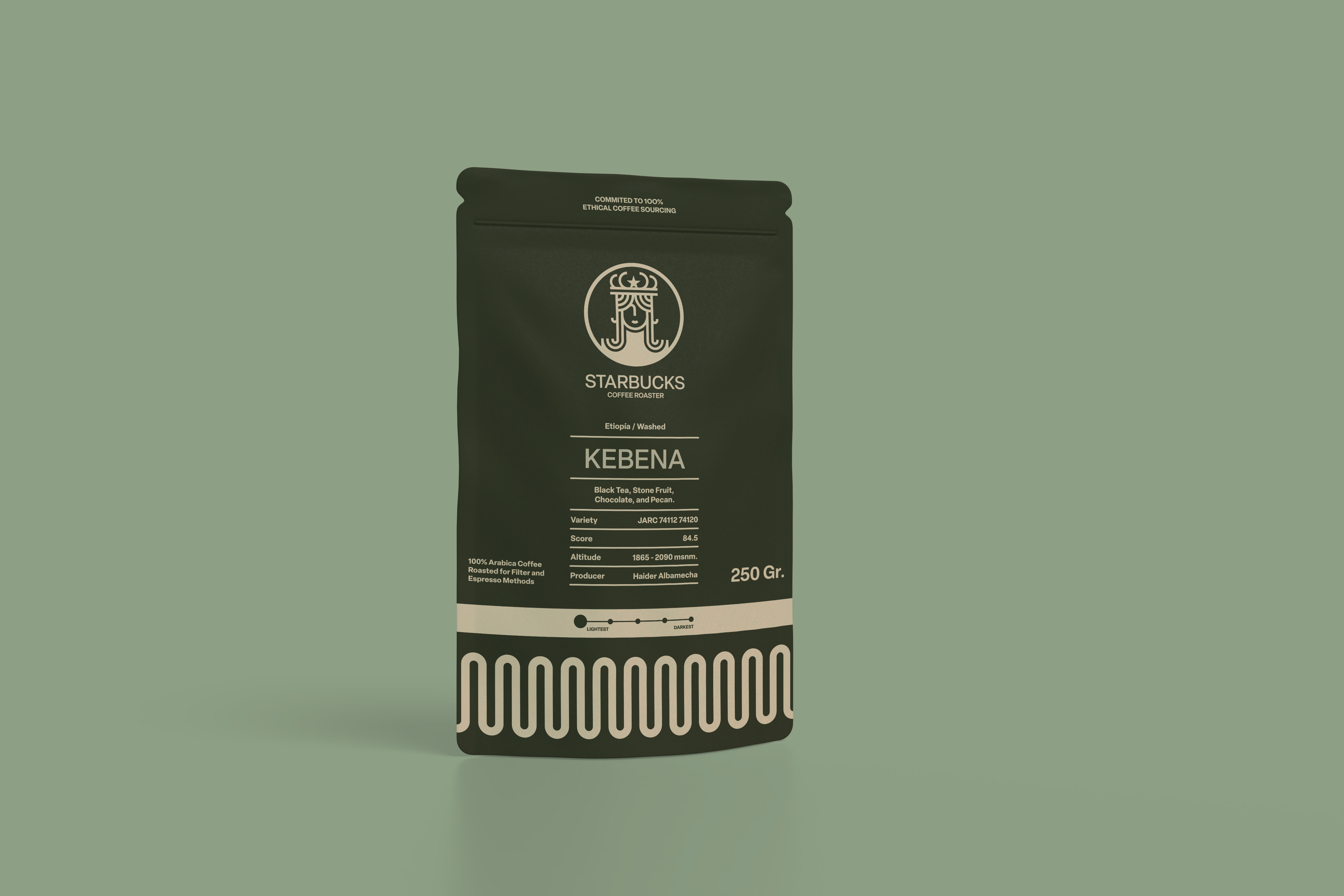
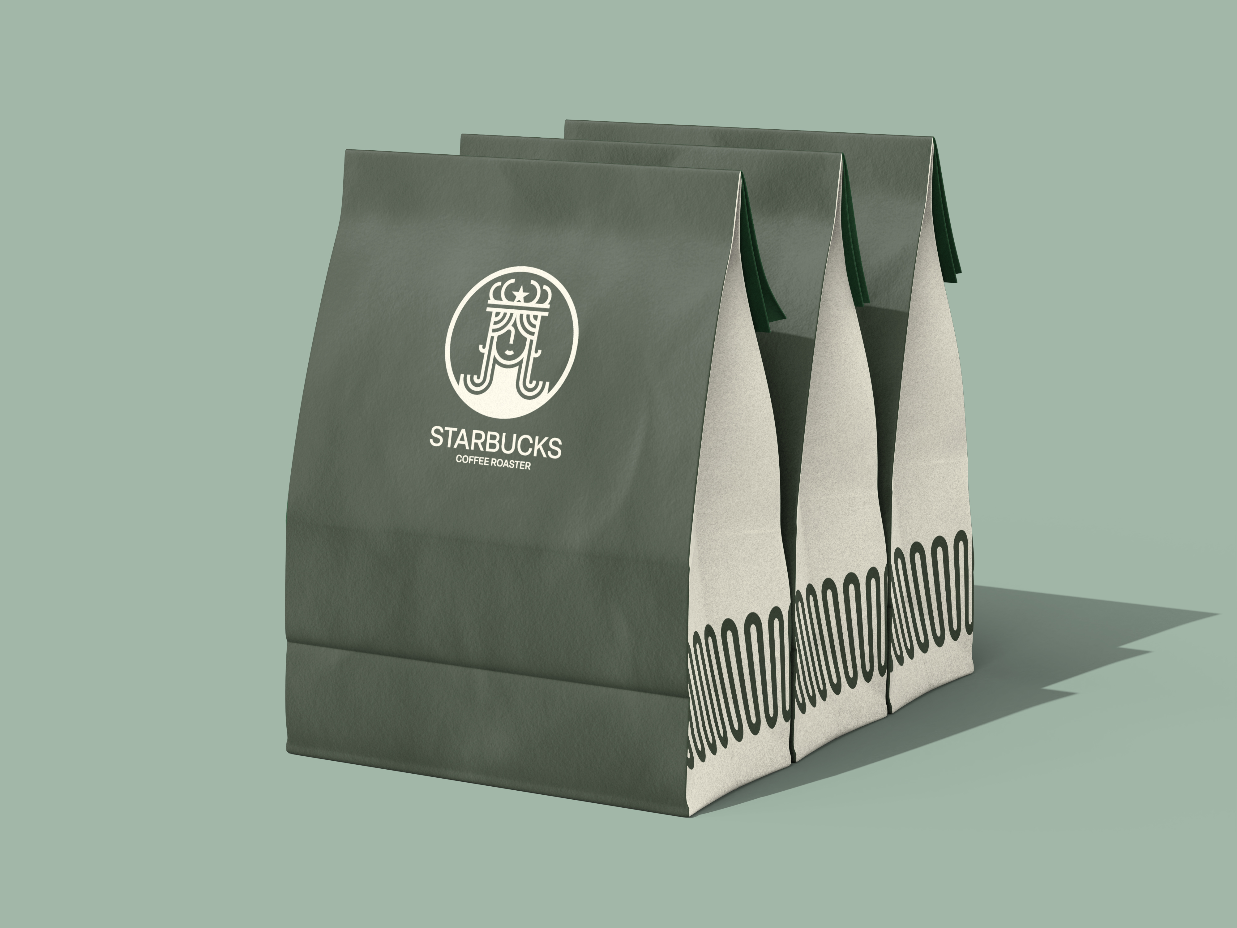
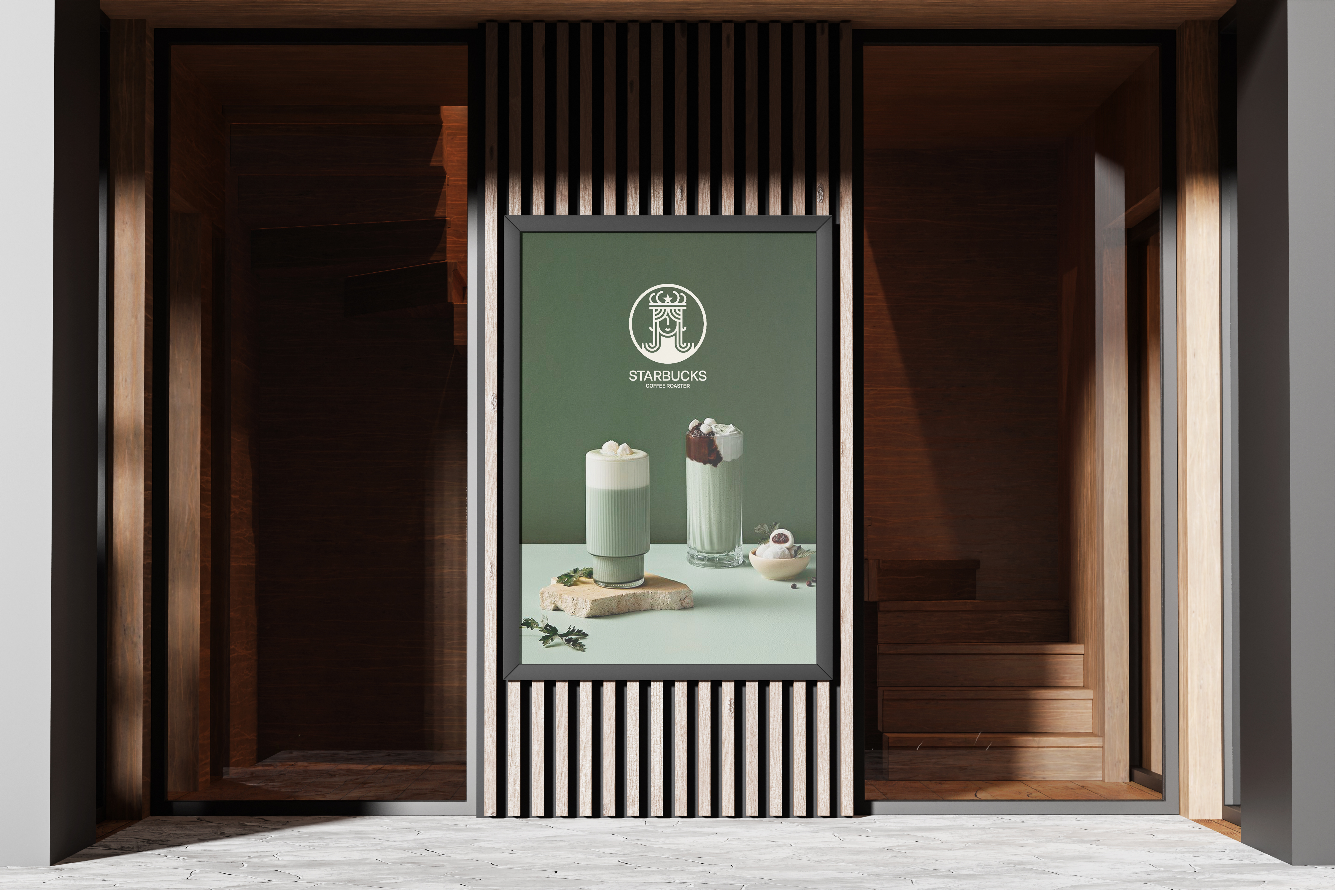
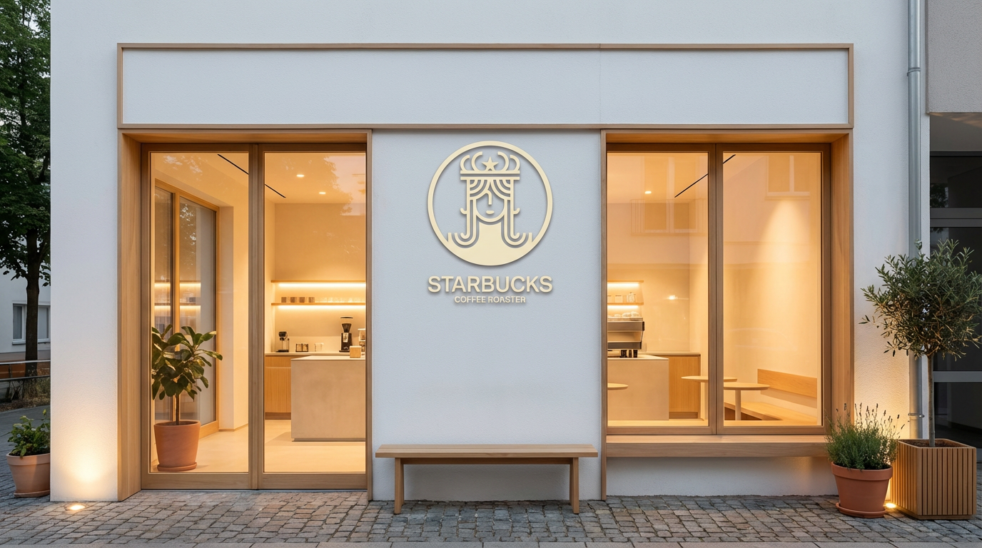
The result strips back the familiar green and the mermaid iconography and replaces them with a more editorial, tactile identity — one that feels at home in a third-wave coffee shop rather than a shopping mall.
Challenges
The hardest part of a self-directed project is defining your own constraints. Without a real brief, scope creep is constant — it's tempting to keep redesigning forever. I solved this by giving myself a fixed deadline and a clear deliverable list: wordmark, colour system, packaging mockup, and motion sting. Finishing on time, even with invented pressure, is its own discipline.
The Process
Setting the Brief
I started by defining what the project was not: it wasn't a rebrand for the mass-market Starbucks. Instead I imagined a sub-brand or premium line — Starbucks Coffee Roaster — that could coexist with the main brand while carving out a distinct space in the specialty coffee market.
Visual Research
I studied how leading specialty roasters — Blue Bottle, Onyx, Intelligentsia — communicate craft and provenance through typography, paper texture, and restraint. The common thread was confidence in simplicity: minimal colour, strong type, and an emphasis on origin storytelling.
Identity Design
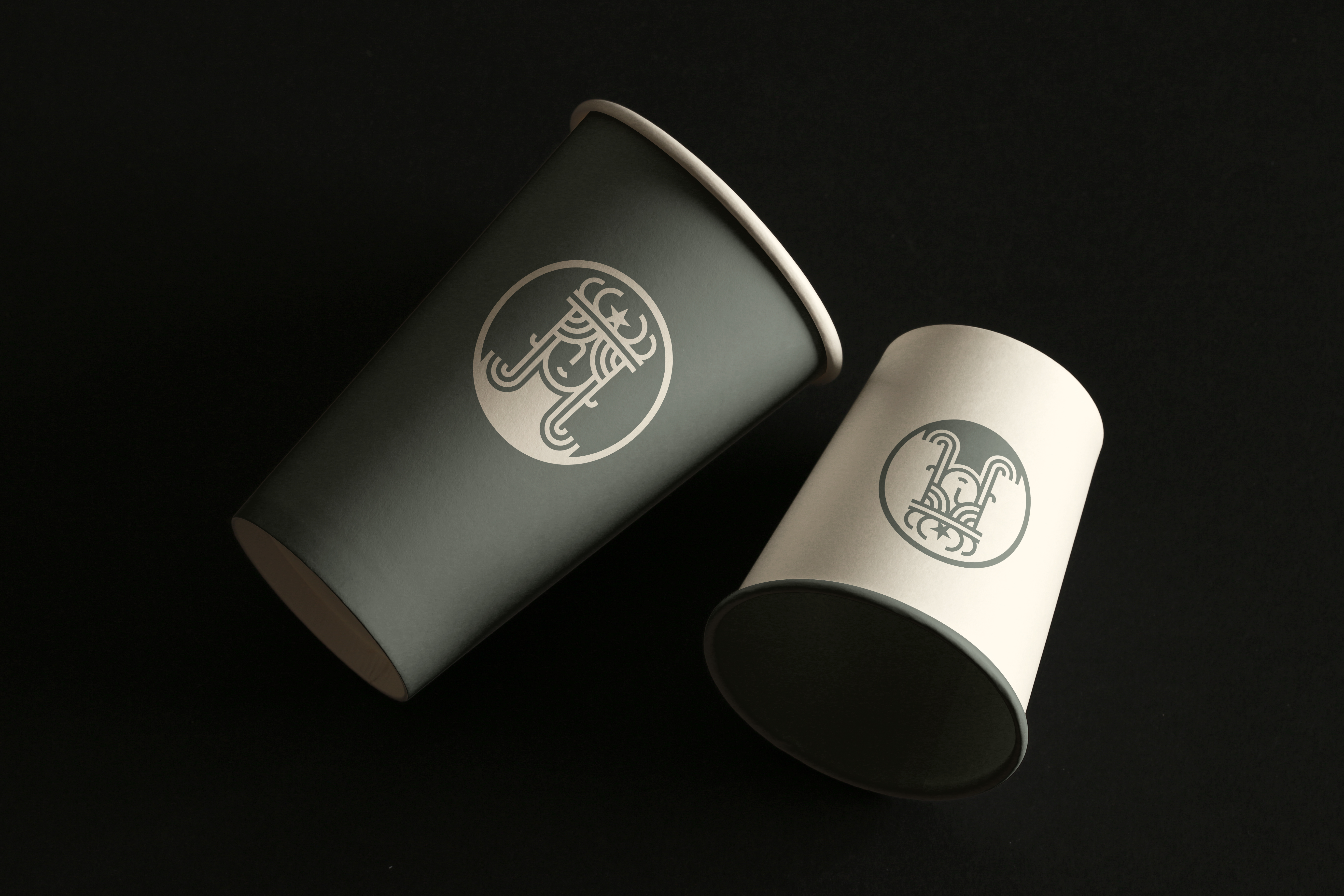
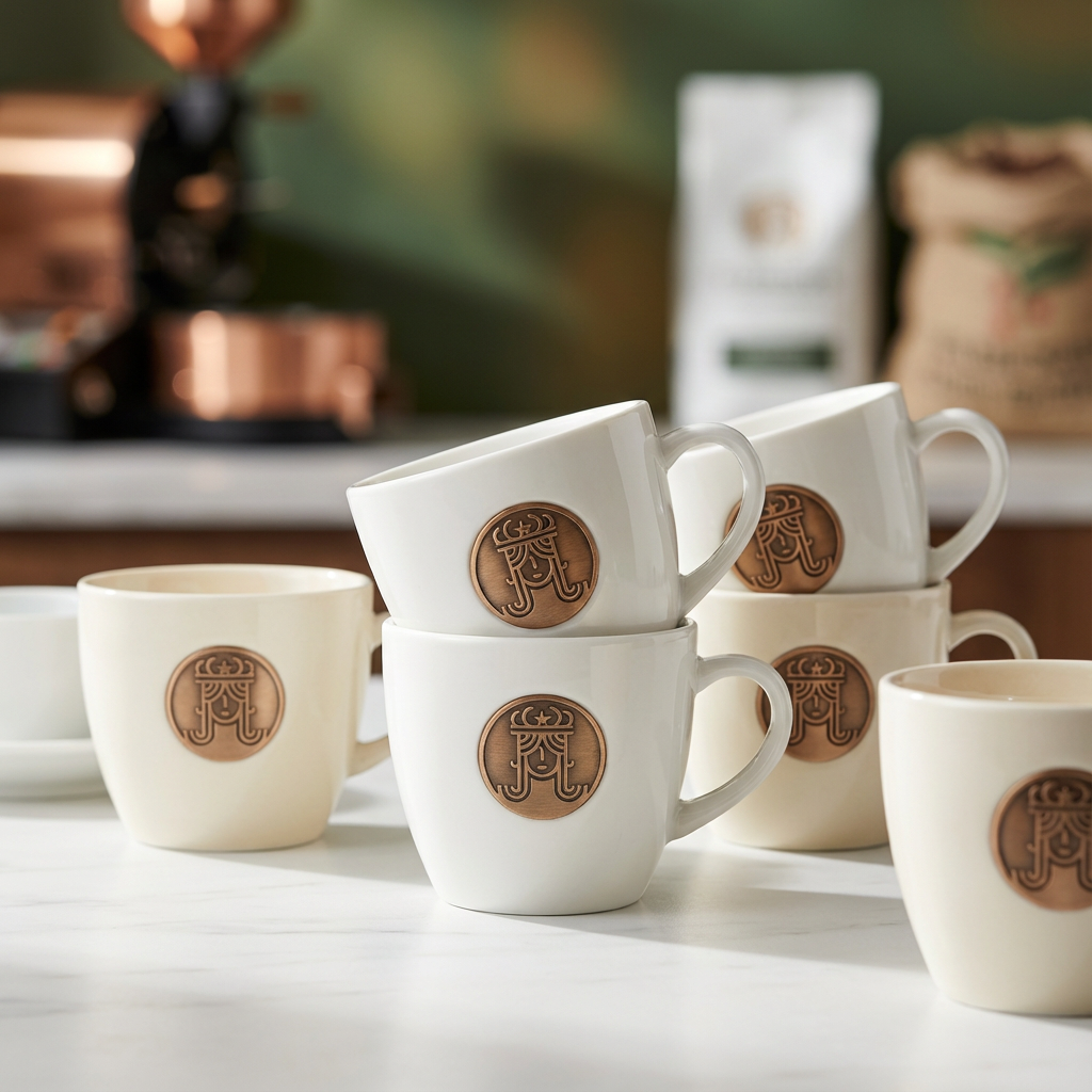
In Illustrator I developed a new wordmark and a refined icon system that retained a subtle nod to the original Starbucks siren without copying it. The palette moved away from green toward warm espresso browns, cream, and deep navy — colours that feel both premium and approachable.
Motion & Presentation
After Effects was used to bring the identity to life with a short reveal animation, simulating how the brand might appear on digital signage or in a campaign context. Figma handled the mockup layout and presentation deck.