Time Out
A team project building a board game from concept to final print — I led the visual identity, from logo and colour palette to production-ready graphic elements.

Overview
Time Out is a board game developed as a team project, taken from initial concept all the way through to a finished, print-ready presentation. My role centred on the visual identity — defining how the game would look and feel before a single piece was printed.
From the logo to the colour palette, every graphic decision was made to reinforce the game's theme and ensure the final result felt cohesive, polished, and ready for the table.
Challenges
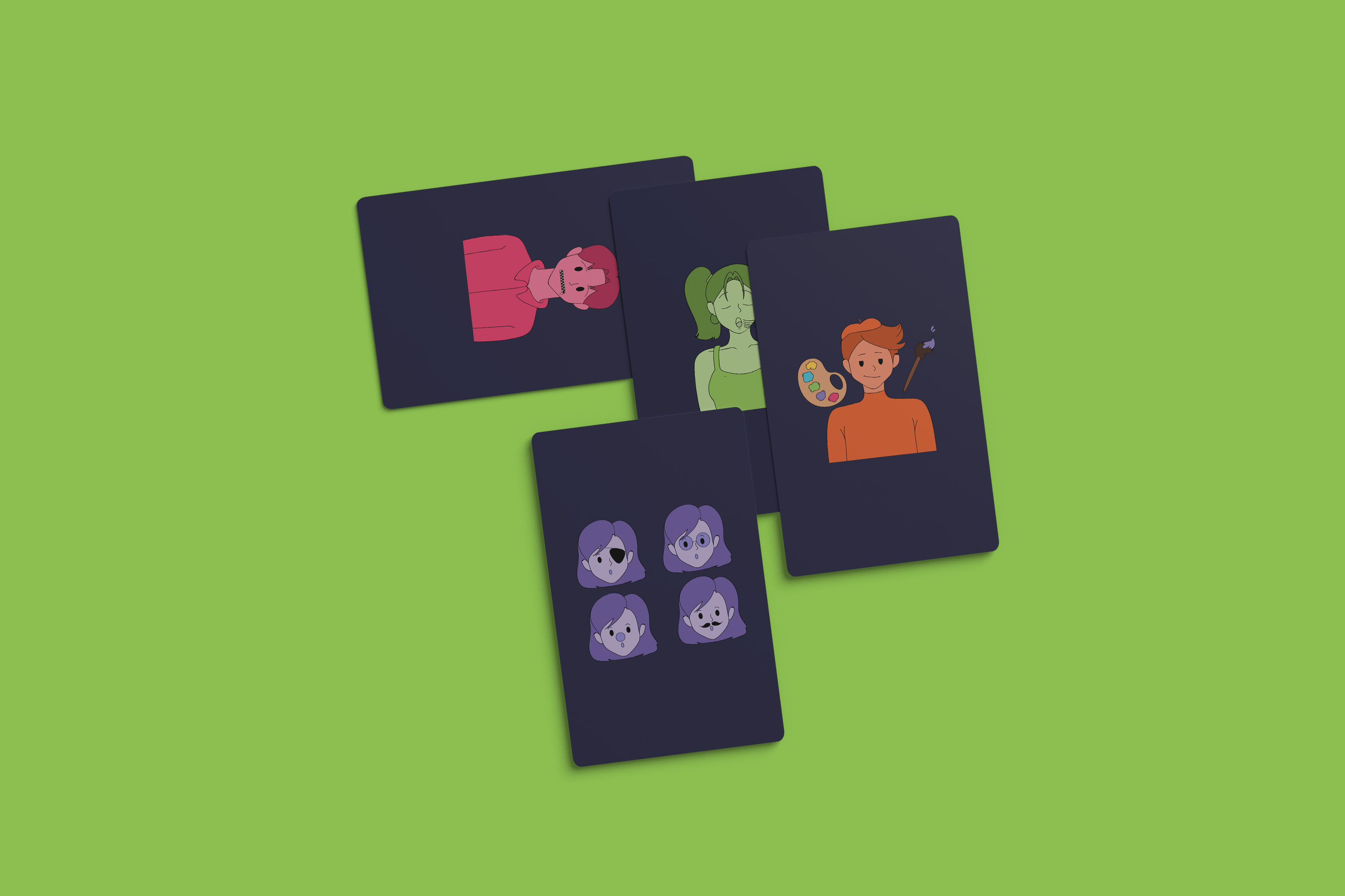
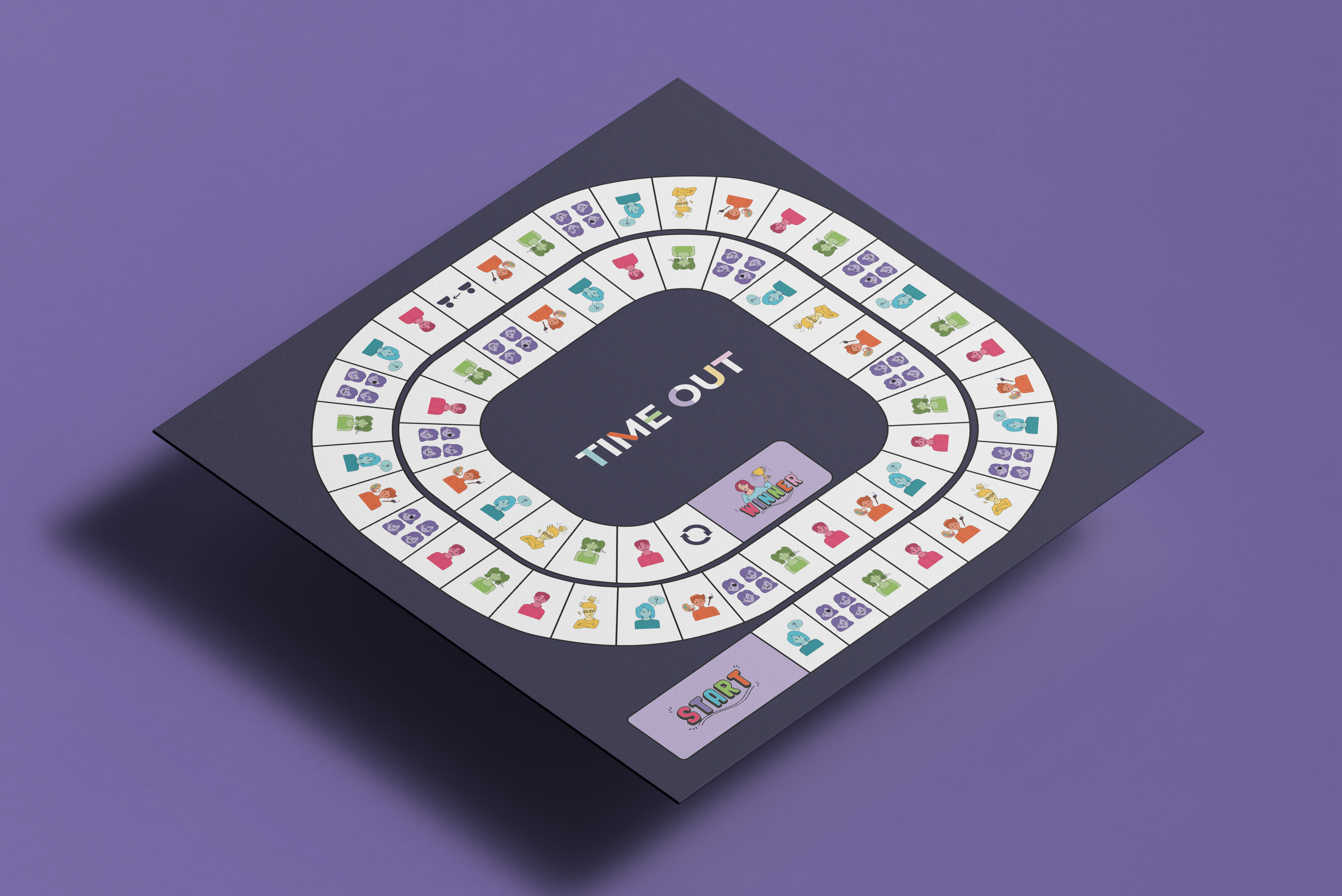
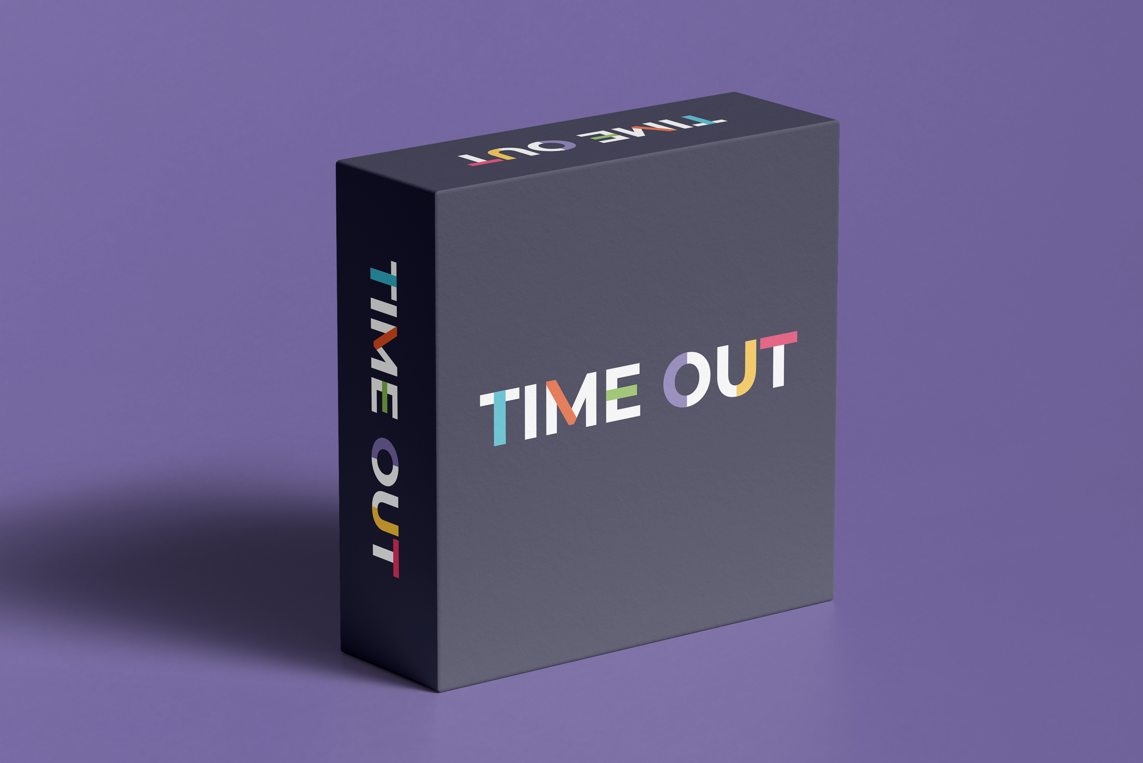
The main challenge was designing a visual system that felt unified across a wide variety of physical pieces — box, cards, board, tokens — each with different size and material constraints. Maintaining consistency without making everything look identical required a careful balance of repetition and variation.
The Process
Concept & Theme Definition
Working alongside the game designers, I translated the core mechanics and mood of Time Out into a visual language. Early moodboards explored tone, era, and style references before settling on a direction.
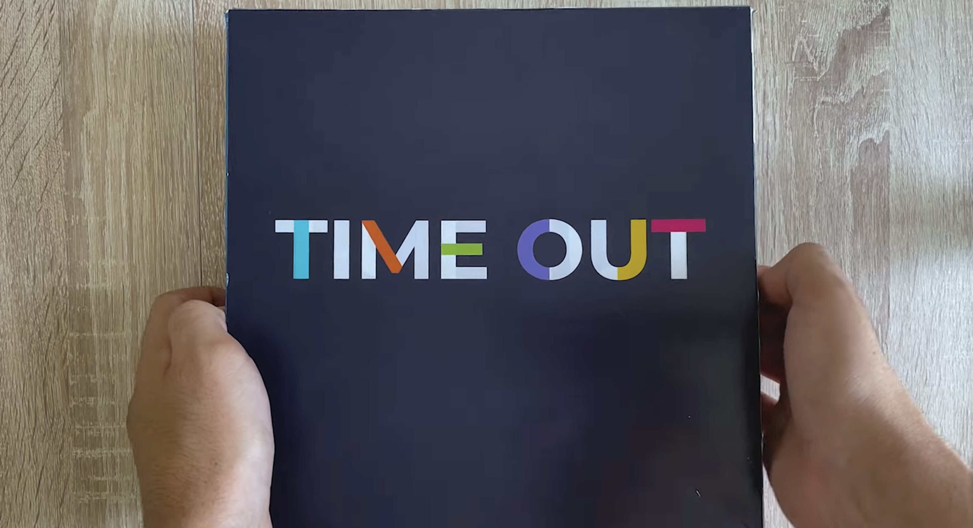
Logo & Identity
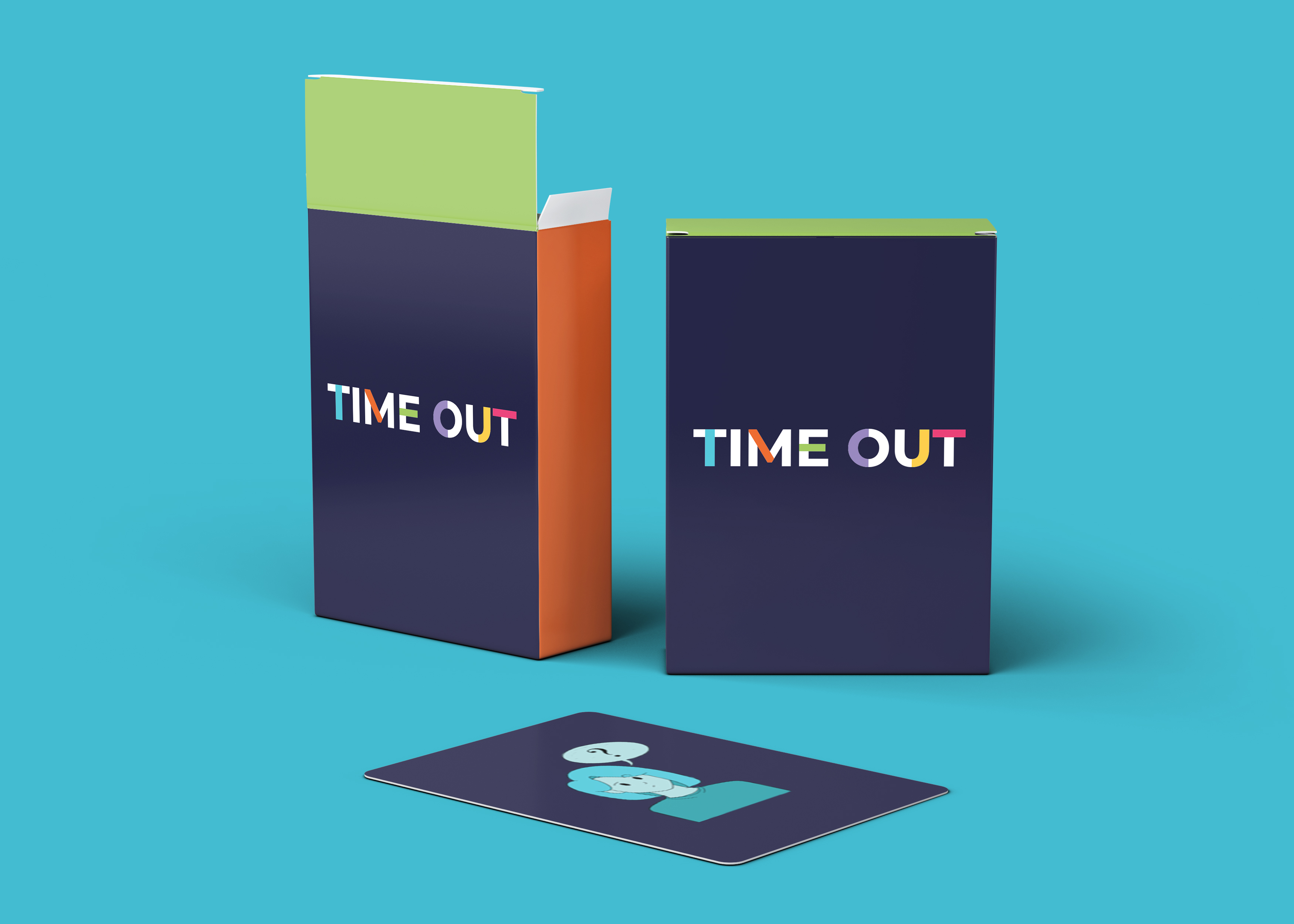
I designed the wordmark and supporting graphic elements from scratch, focusing on clarity and character. The logo needed to work across multiple scales — from box cover to game tokens — so versatility was a key constraint.
Colour Palette & Typography
The palette was selected to evoke the game's atmosphere while remaining legible under varied lighting conditions. Type choices followed the same logic: readable at small sizes, expressive at large ones.
Print Production
I prepared all final assets in InDesign and Illustrator, setting up files with correct bleed, colour profiles, and print specs. The goal was a presentation that looked as considered in person as it did on screen.