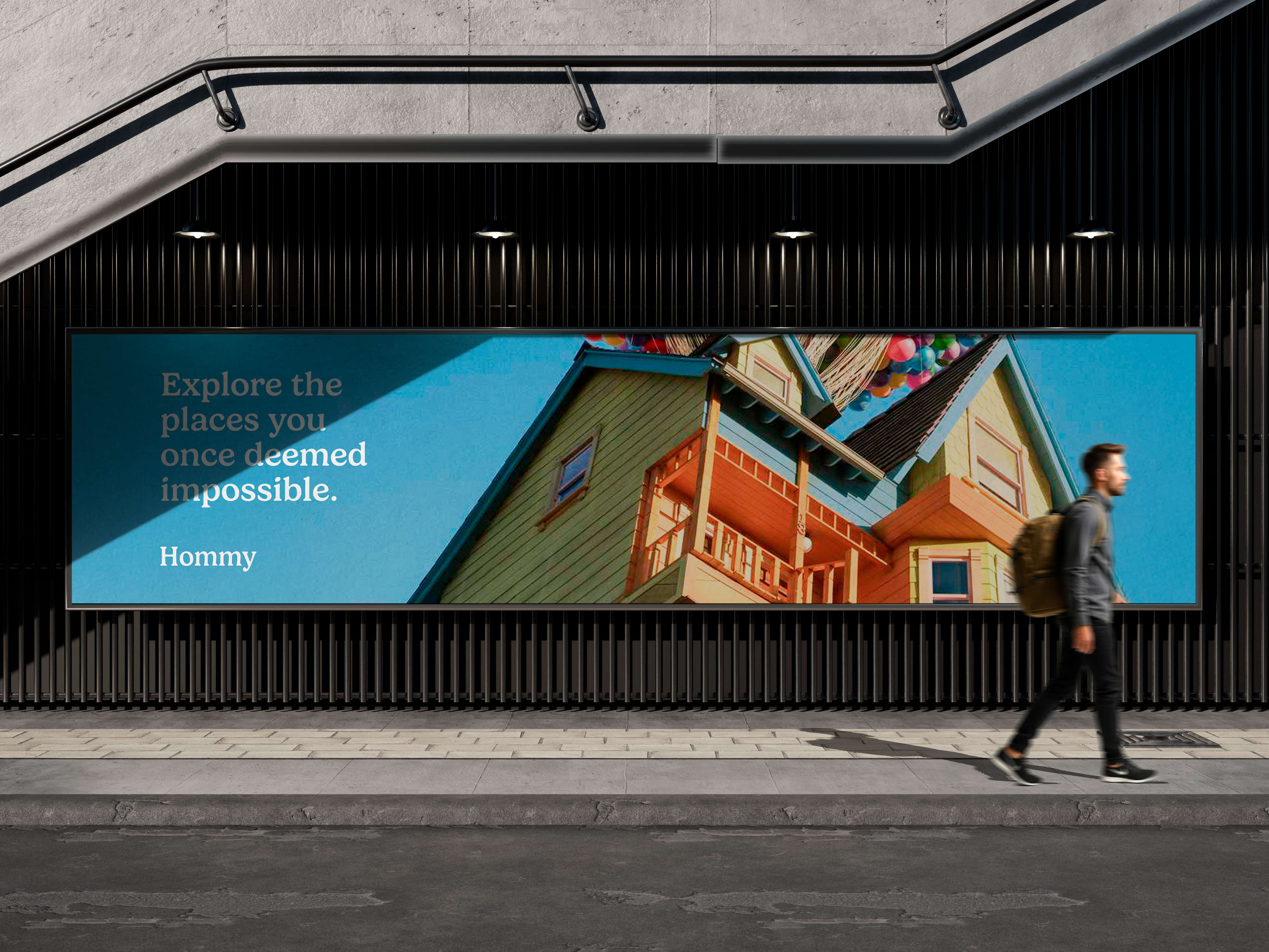
Hommy
A brand identity and app design for a platform that lets you rent individual spaces within larger shared venues.

Overview
Hommy is a conceptual platform designed to make large underused spaces work harder. The idea is simple: a co-working venue, a community hall, or a hotel lobby can carve up its floor plan into bookable zones — and Hommy connects those zones with the people who need them for a few hours.
The brand needed to feel approachable and modern without being generic. The challenge was designing something that could speak to two very different audiences: space owners looking for a revenue tool, and individuals or small teams looking for a flexible, affordable place to work or meet.
Challenges
The hardest design problem was the map-based browsing experience. Showing multiple bookable zones within a single building, each with different prices, sizes, and availability windows, without overwhelming the user required several rounds of testing and simplification. The final solution used a layered reveal pattern: building first, then zone, then detail.
The Process
Research & Concept
I mapped the competitive landscape — from co-working giants to peer-to-peer rental apps — to understand where Hommy could differentiate. The insight was that most platforms feel either too corporate or too casual. Hommy needed a middle ground: warm, trustworthy, and quietly smart.
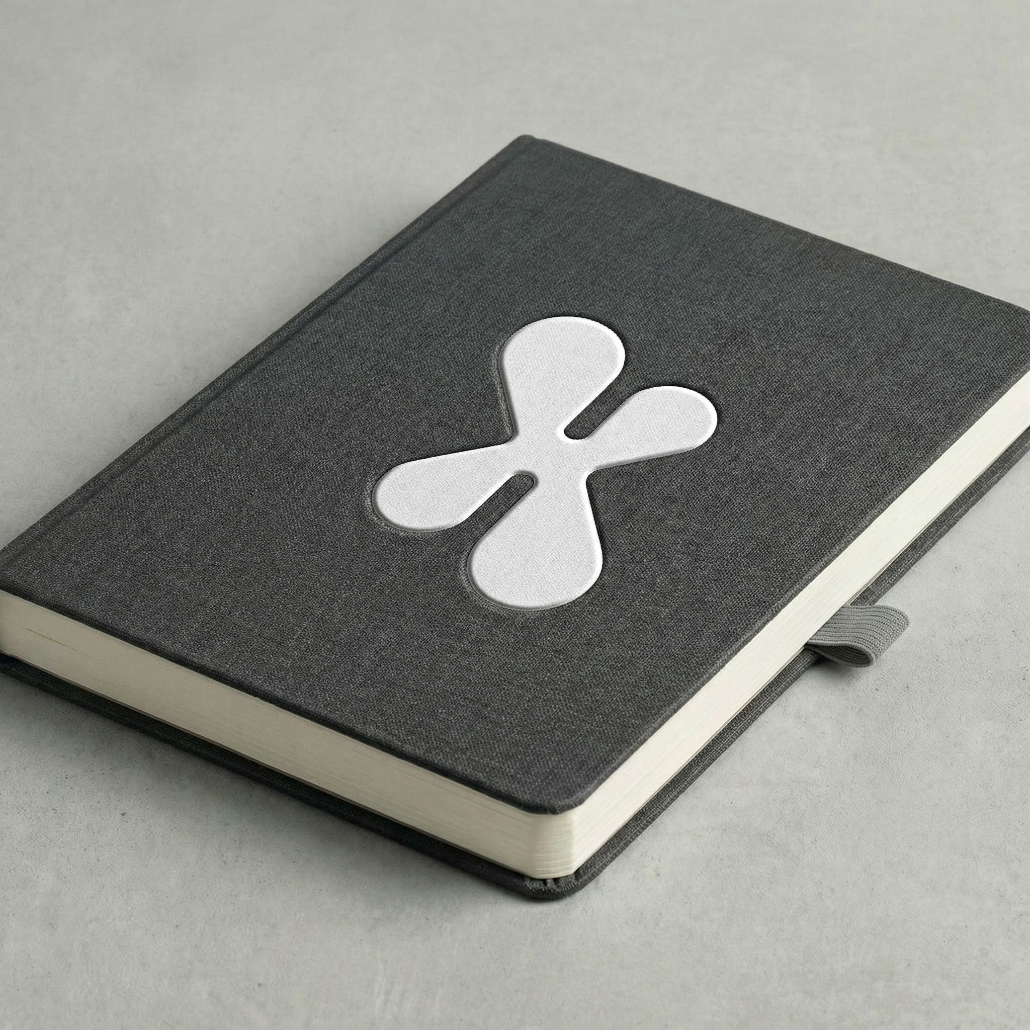
Brand Identity
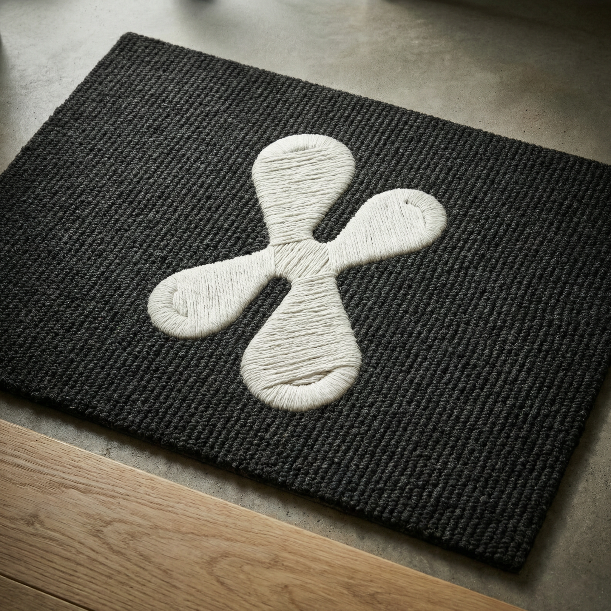
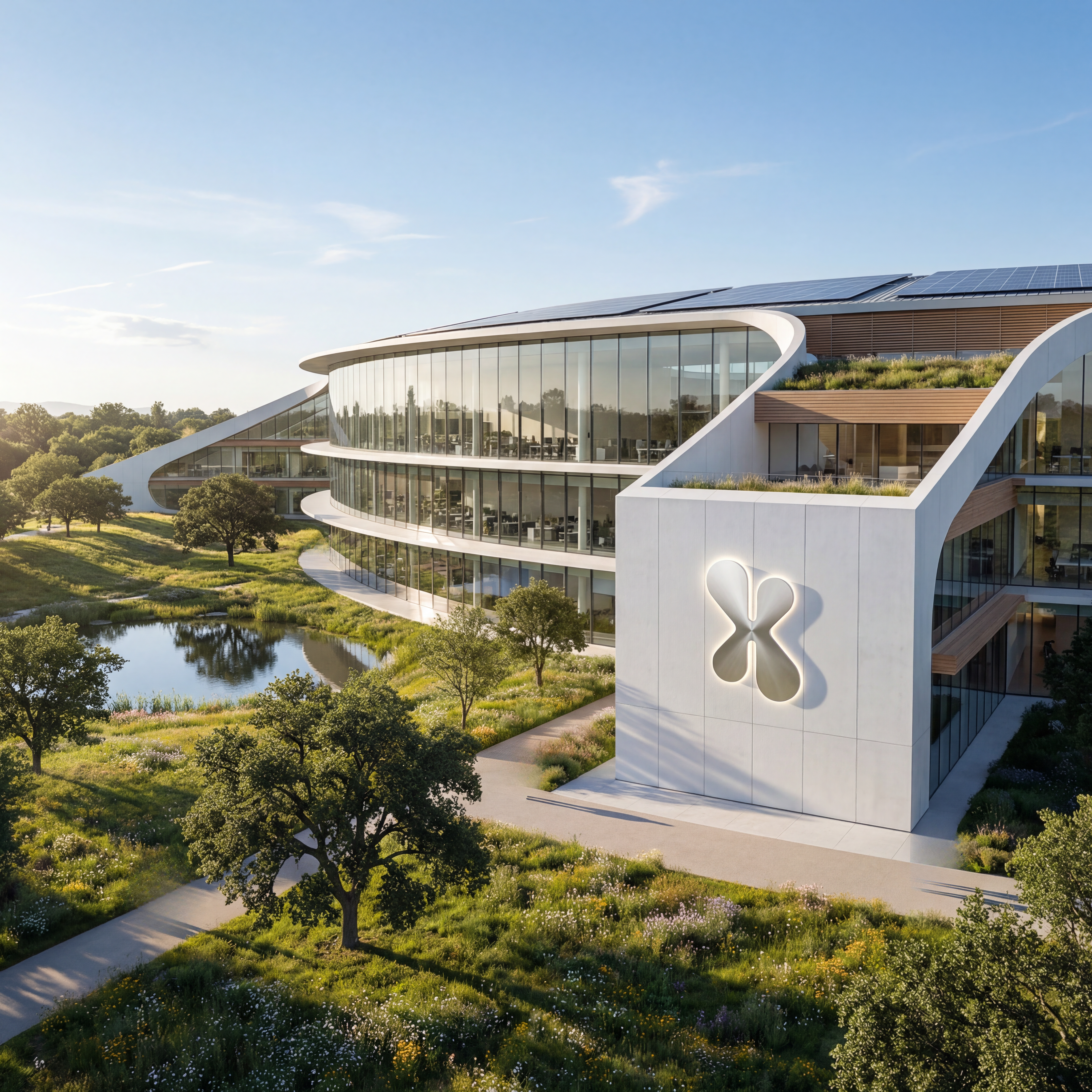
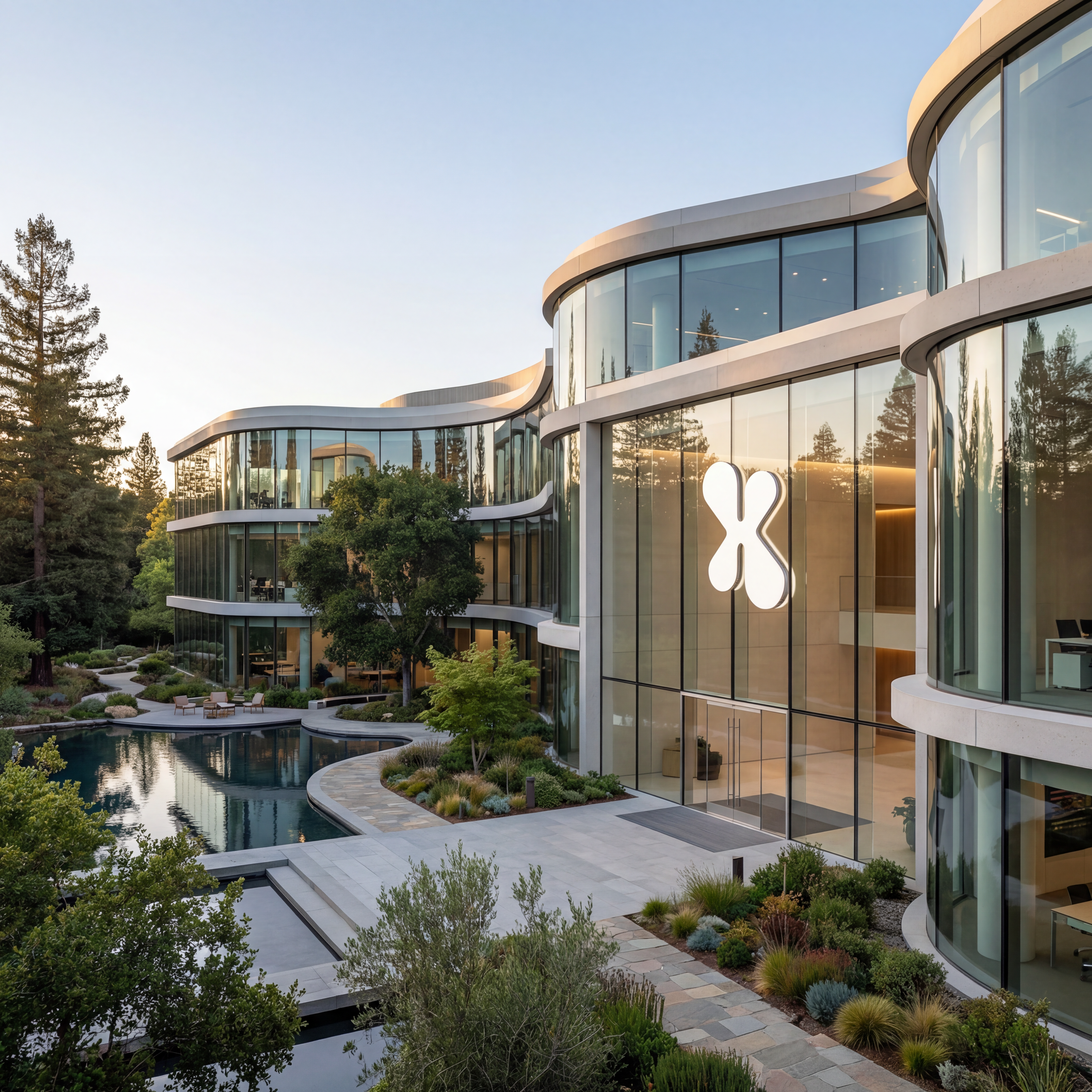
The wordmark uses a rounded geometric sans-serif that feels friendly without being childish. The colour palette centres on a warm off-white and a deep teal, with a soft amber accent for CTAs. The icon system was built around the idea of partitioning — simple shapes nested inside larger ones — to visually communicate the concept of space within space.
App Design
The UI was designed in Figma across iOS and Android breakpoints. The key screens — map view, space detail, booking flow, and host dashboard — were iterated through three rounds of low-to-high fidelity prototyping. The interaction model prioritises speed: most bookings should take under four taps.
Motion & Handoff
Micro-animations were designed in After Effects to bring the onboarding and booking confirmation moments to life. The final deliverable included a full component library, motion specs, and a brand guidelines document covering logo, colour, typography, and tone of voice.