Uber
A personal redesign exercise exploring what Uber's visual identity could look like with a more premium, human-centred direction.
Overview
This was a self-initiated exercise with a simple premise: what would Uber look like if it felt less like a tech utility and more like a considered, premium service brand?
The project explores an alternative visual identity — new typography, a refined colour system, and a set of touchpoints that push the brand toward something more intentional without losing the clarity and speed that Uber's identity depends on.
Challenges
Redesigning a brand as recognisable as Uber means every decision gets judged against what already exists. The challenge was staying bold enough to make the exercise meaningful while being honest about what the existing identity does well. The best redesigns borrow from the original — they don't erase it.
The Process
Defining the Direction
I started by identifying what feels missing from Uber's current identity: warmth, craft, and a sense that someone actually designed it. The goal wasn't to make it luxury — it was to make it feel considered. Premium without being cold.
Typography & Colour
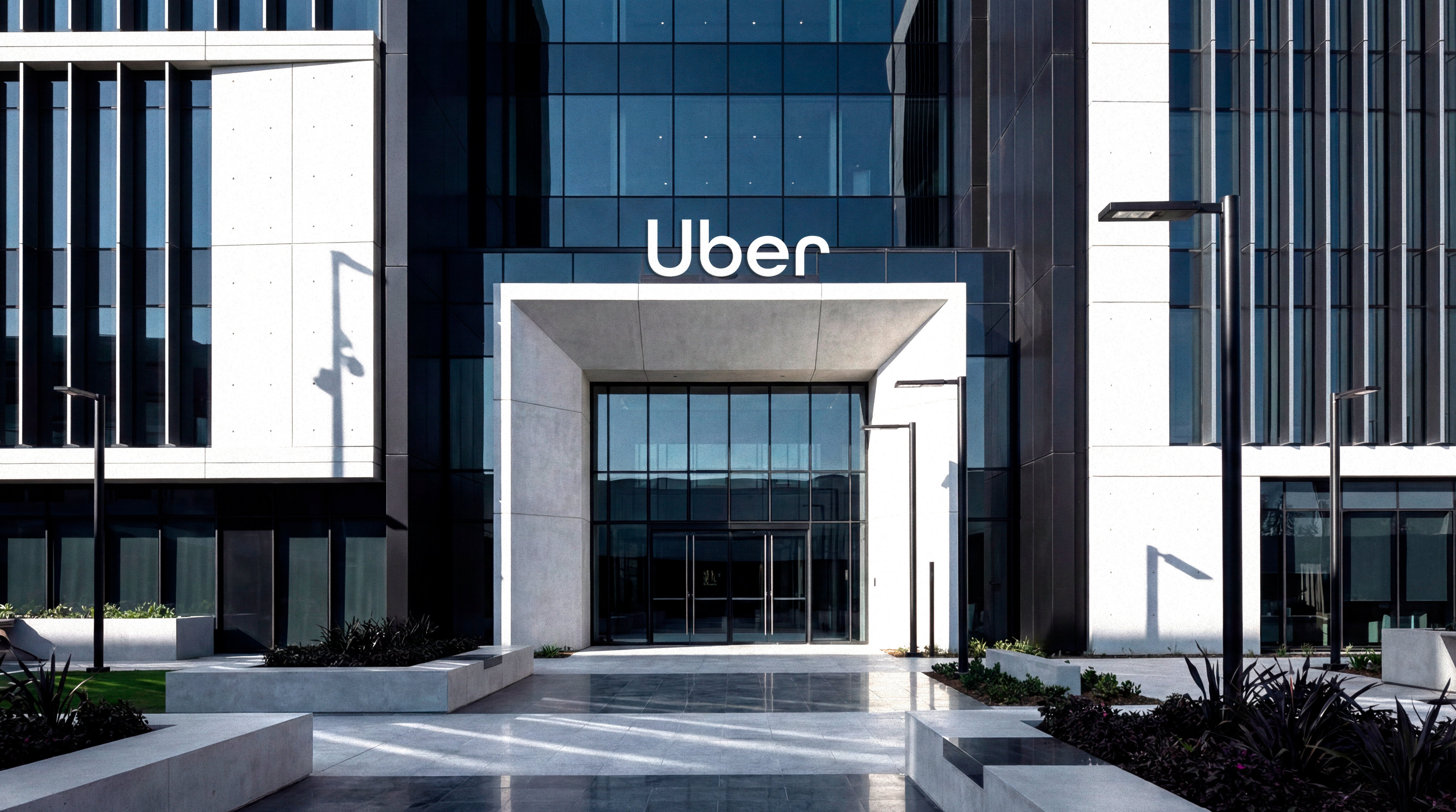
In Illustrator I explored alternative wordmarks and type treatments, moving away from the flat sans-serif toward something with more character. The colour system retained black as the anchor but introduced a secondary palette that could flex across light and dark environments.
Touchpoints
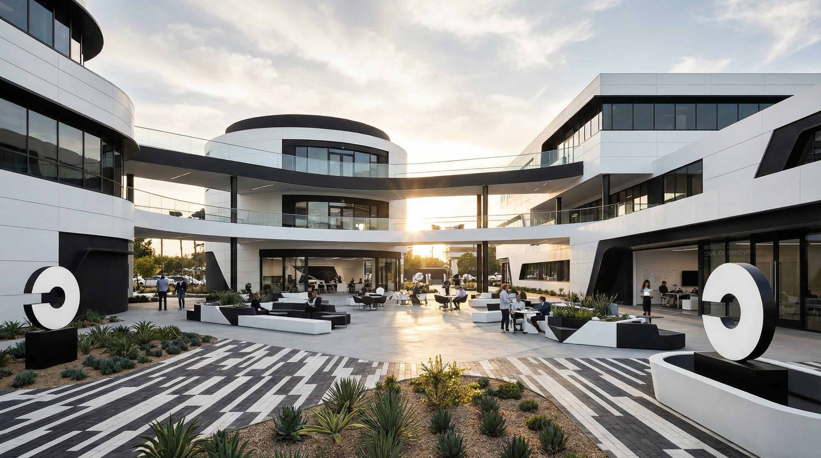
Figma was used to apply the identity to real touchpoints: the app icon, vehicle signage, driver cards, and in-app UI moments. Each one tested whether the direction held up at different scales and contexts.
Motion
After Effects was used to animate the logo transition and a short brand sting — the kind of thing that would appear at the start of a campaign video. Motion is where a lot of brand identities fall apart, so it was an important test.