Orellies
A brand identity for a slow-fashion label rooted in natural materials, honest craft, and quiet confidence.
Overview
Orellies is a conceptual clothing brand built around the idea that what you wear should feel as good as it looks. The brief was to create an identity that communicated sustainability and craftsmanship without falling into the typical 'eco' visual clichés — no leaves, no earthy greens, no recycling symbols.
The result is a restrained, confident brand system grounded in natural textures, neutral tones, and a typographic voice that speaks softly but clearly. Every element was designed to age well — both on the garment tag and on a billboard.
Challenges
The main challenge was avoiding visual clichés in the sustainable fashion space. Every time a direction started to feel 'too organic' or 'too clean', I pulled back and asked what the brand would actually look like five years from now. That question kept the design honest and pushed the work toward something more timeless than trendy.
The Process
Brand Positioning
I started by mapping out the slow-fashion landscape to understand where Orellies could carve out its own space. The positioning landed between minimal luxury and accessible craft — a brand that doesn't shout about sustainability but lives it through every material choice and design decision.
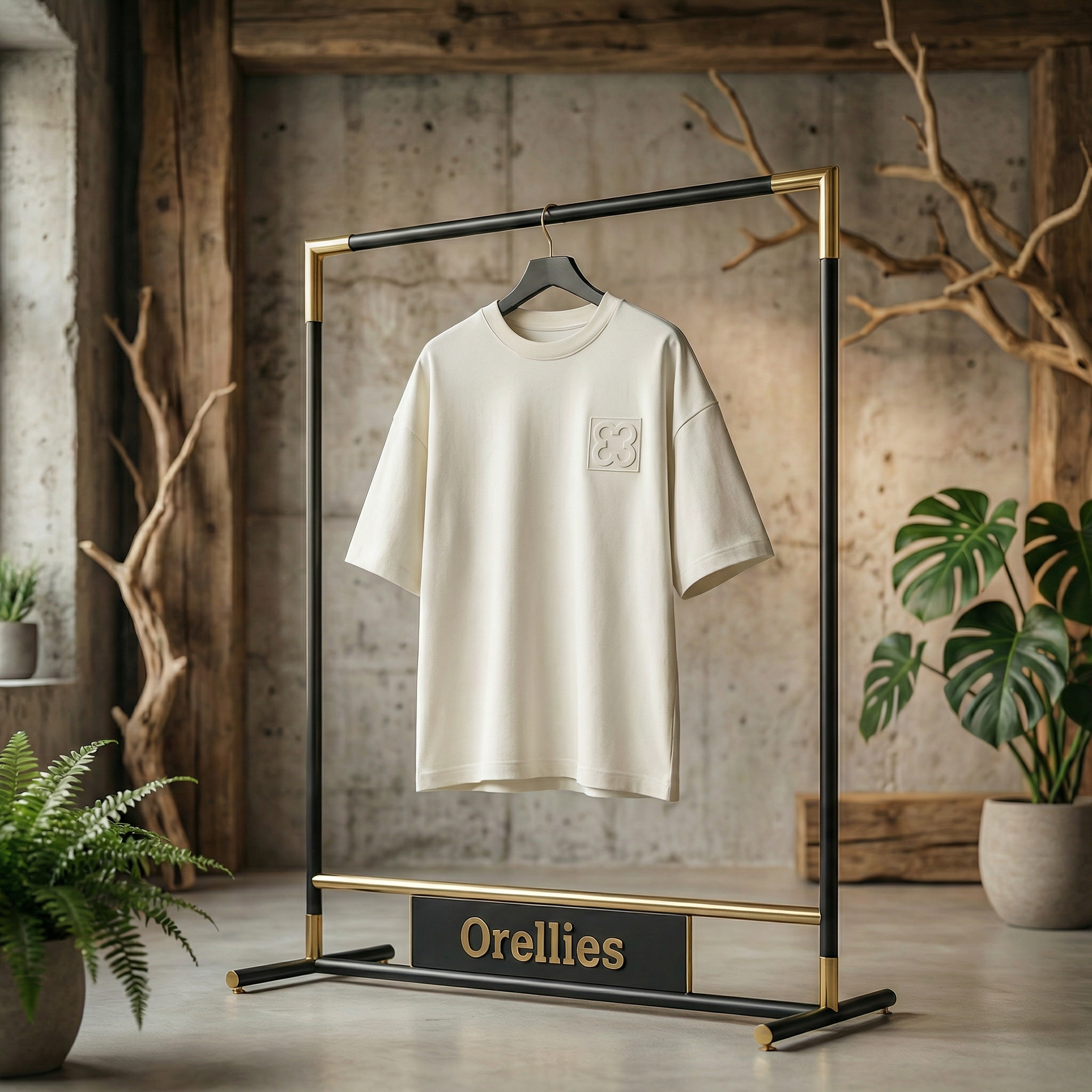
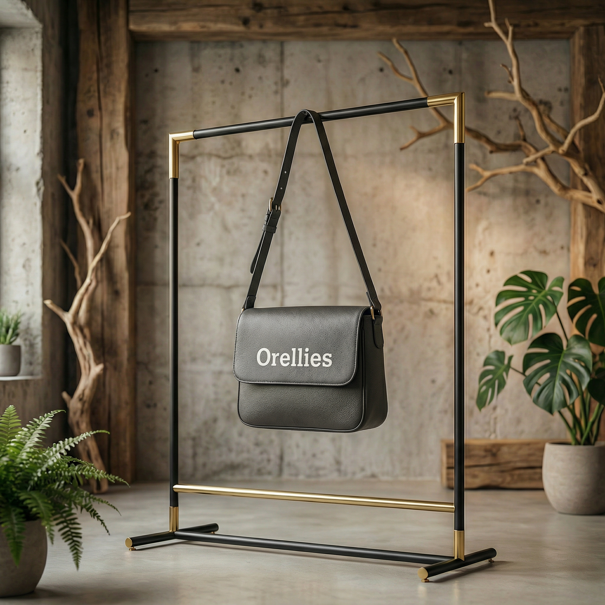
Visual Identity
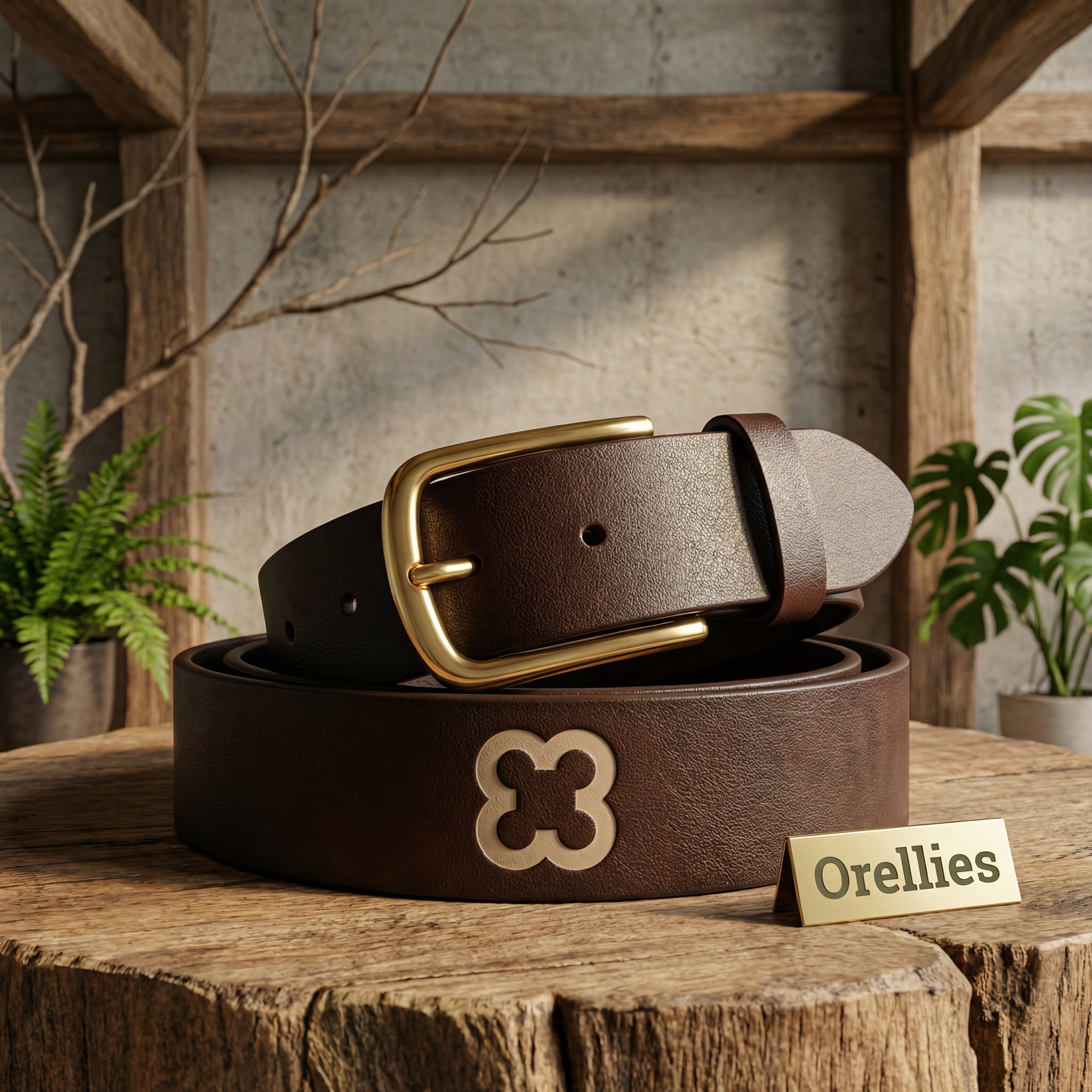
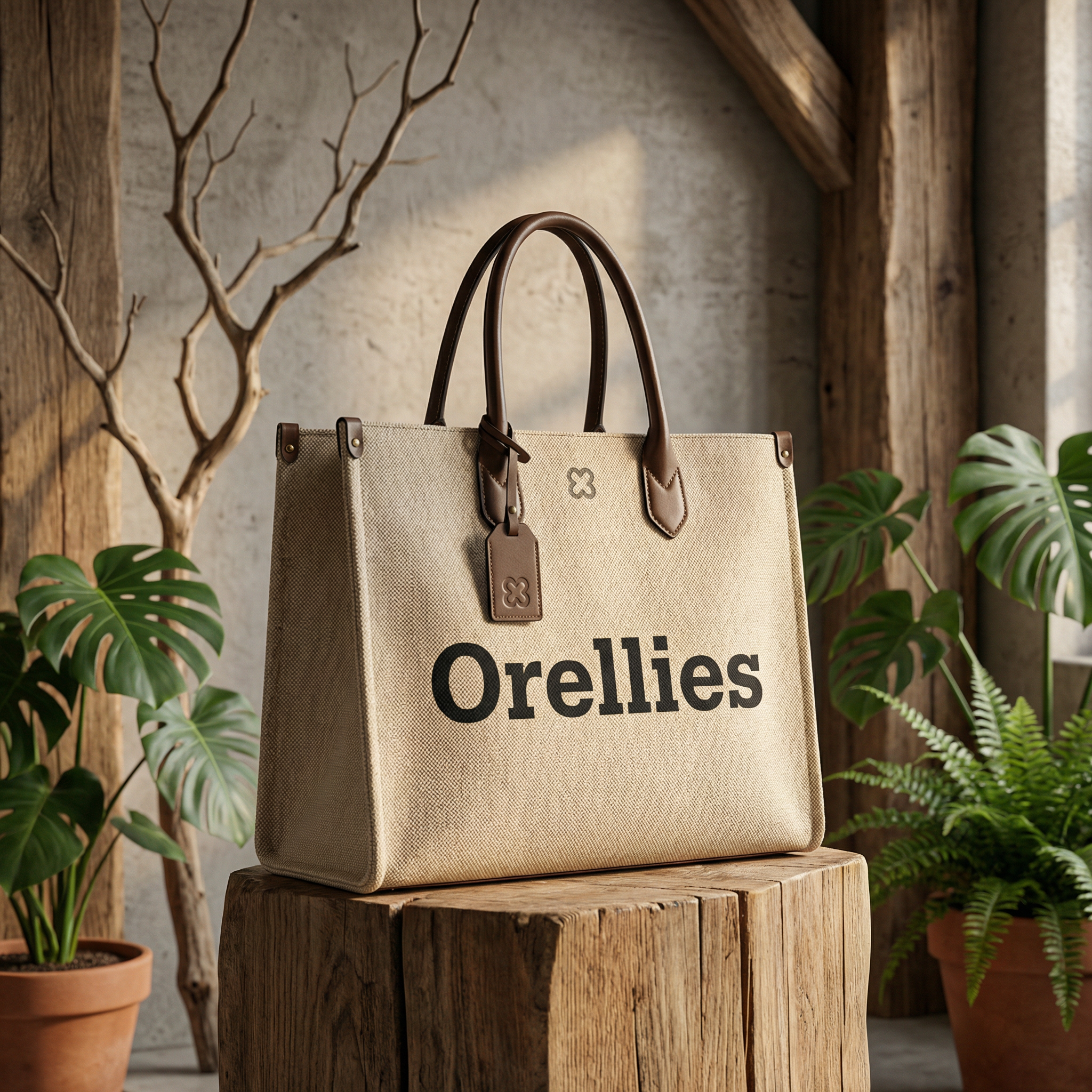
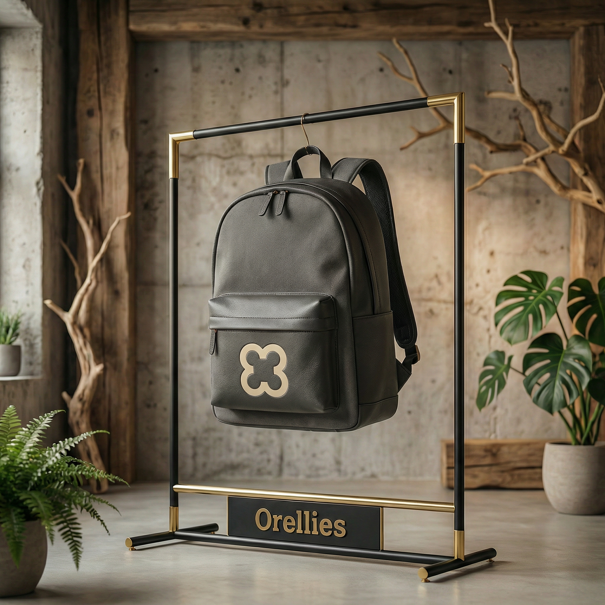
The wordmark is set in a custom-spaced serif that references traditional tailoring without feeling dated. The palette draws from undyed linen, raw cotton, and stone — colours that hold their own across seasons. A secondary texture system built from close-up fabric photography adds depth to layouts without relying on illustration.
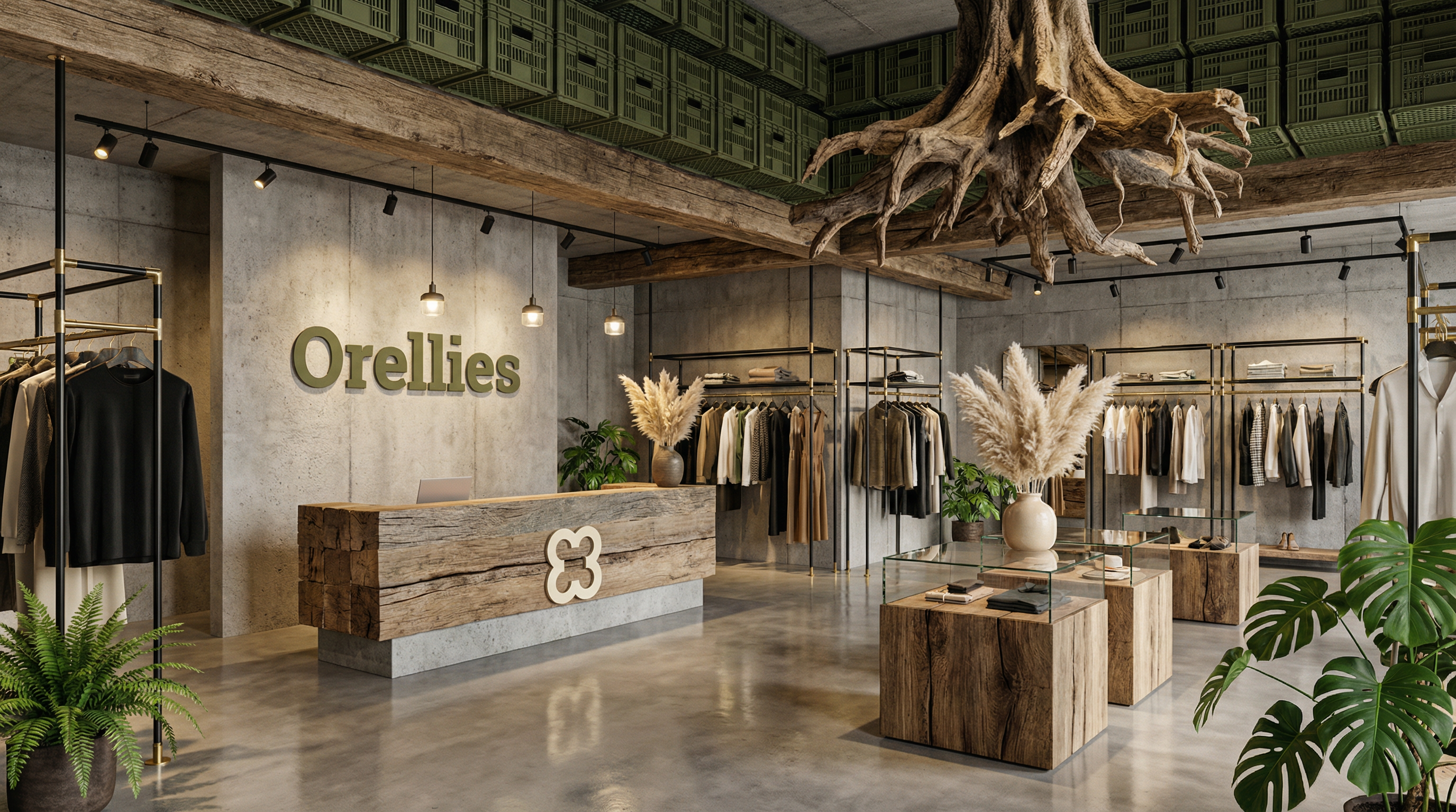
Brand Applications
The system was applied across garment labels, lookbook layouts, packaging, and social templates. Special attention was paid to how the identity behaved on physical materials — the logo embossed on kraft paper, printed on uncoated stock, and stitched onto canvas all needed to feel like the same brand.
Final Delivery
The project was delivered as a complete brand guidelines document covering logo usage, colour, typography, photography direction, and tone of voice. The result is a system flexible enough to grow with the brand, yet defined enough to stay consistent from day one.